- The First Five Minutes — the sale interrupts the onboarding
- The Checkout — where the discount changes the deal
- The First Session as a Member — the app keeps selling Premium to a Premium trial
- The Web — the better lifecycle marketer
- The First Hour of Email — plus eight years of inbox archive
- The Public Record — context, not verdict
- What I'd Fix First — five fixes, in priority order
01 — The First Five Minutes
The sale interrupted the onboarding before the product could say hello.
The launch screen is genuinely great — a rotation of real destinations at real prices (Tokyo, $316, SEA⇄HND). Dream, price, route, in one frame. Then I logged in, and before a single deal loaded: a full-screen takeover, "Biggest sale of the year! 51% off, code SUMMER51." I don't know what Premium is yet. I don't know what the app does yet. And "51% off" of an unstated price is a math problem, not an offer.
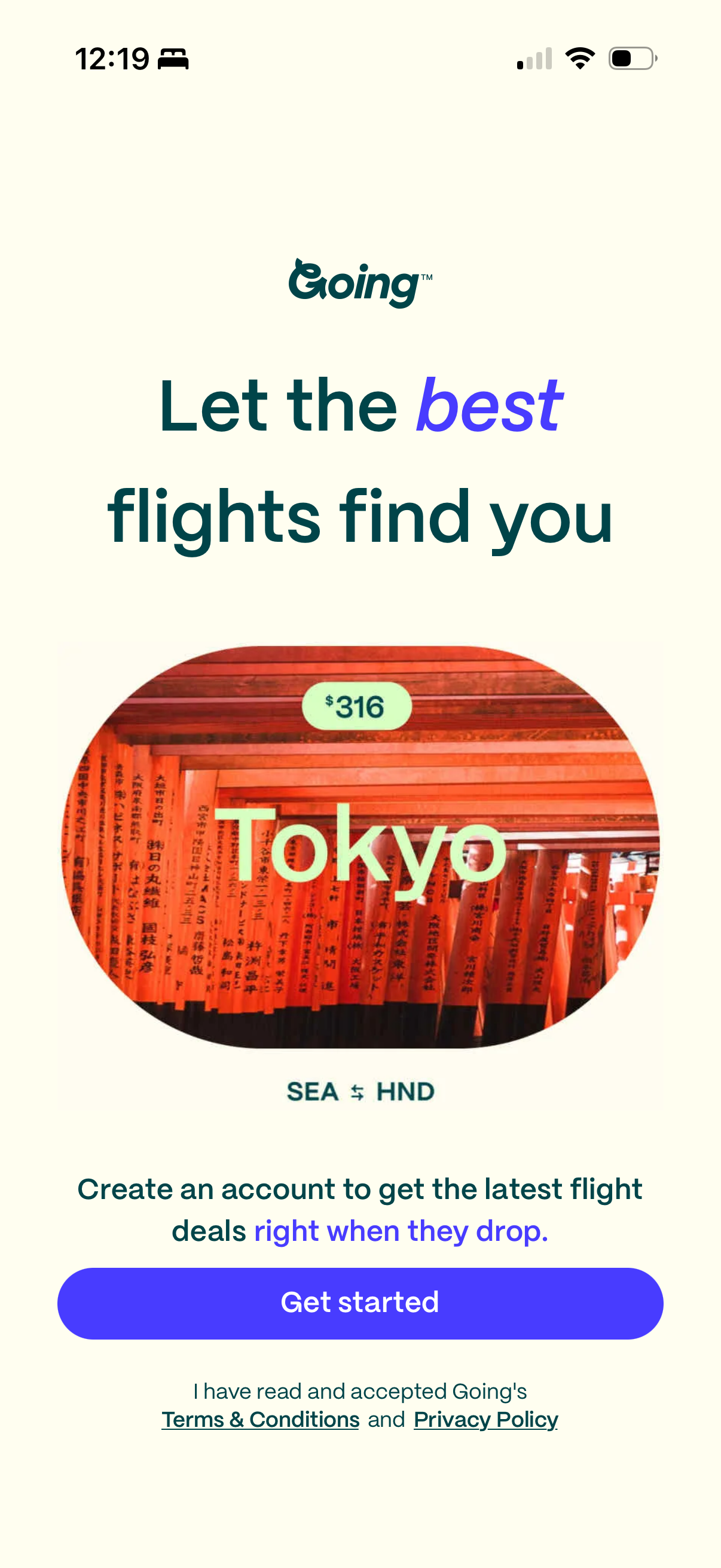
12:19 PM — the best screen in the funnel. Destination, price, route. No copy needed.
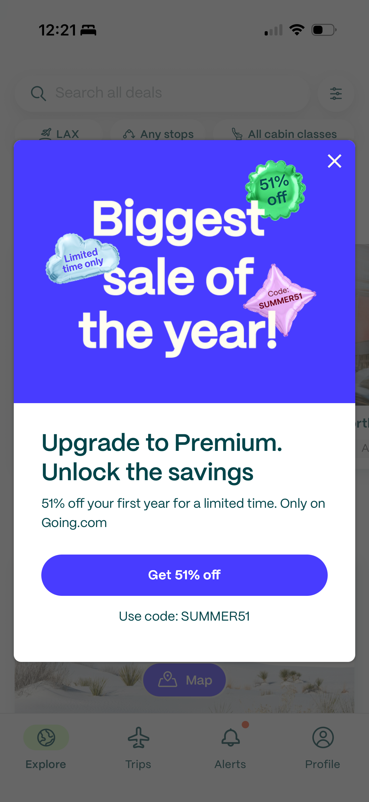
12:21 PM — two minutes later. A discount on a membership I haven't learned about, at a price I haven't been told. There's no in-app onboarding — this popup is the onboarding.
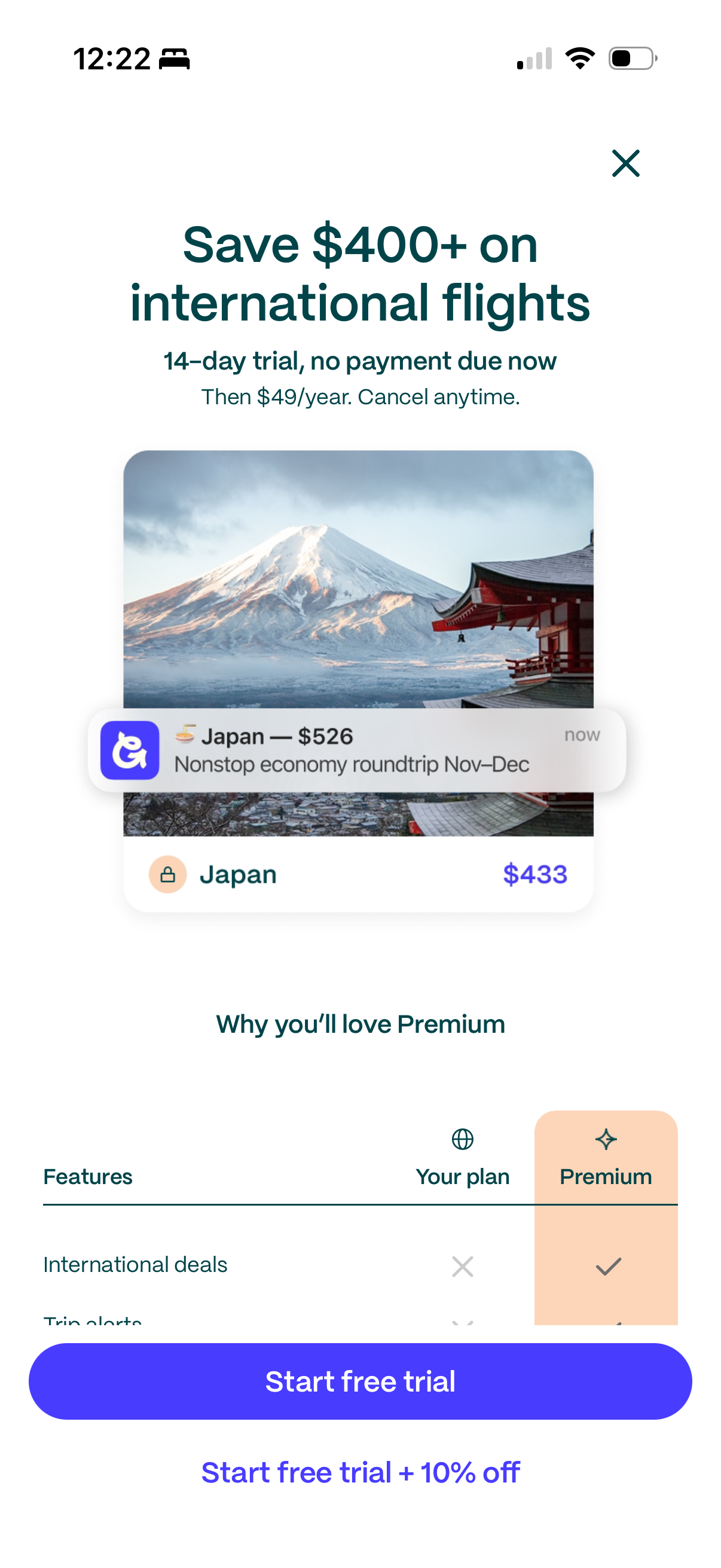
The paywall: "14-day trial, no payment due now. Then $49/year." Hold that promise — it lasts one screen. And "Trip alerts" is sold as Premium, though route price-watching is free in Google Flights; a member who finds that out later feels tricked, not treated.
Tapping "Get 51% off" opens a paywall with four problems on one screen. The headline — "Save $400+ on international flights" — presumes I care about international before asking; there's no quiz, no preference capture, and the acquisition signal from my ad or referral goes unused. The photo runs so tall the benefits table sits below the fold. When the table appears, its first row is "International deals" — the headline again, one screen lower. And the CTA stack offers "Start free trial" beside "Start free trial + 10% off" — ten percent, on the screen the 51% popup just sent me to.
Fix 1 of 3
Sequence value before offer
Gate the sale popup on a first-value event — first deal viewed, first alert set — not first login. Let the launch screen's own magic run one session before the discount interrupts. And never show a percentage without the resulting price: "$24.01 for year one" sells; "51% off" asks the user to do long division mid-scroll.
02 — The Checkout
"No payment due now," said the paywall — until I took the discount.
Credit first: tapping "Start free trial" does exactly what it should — a native App Store sheet, genuinely no payment due, done in seconds.
The mess lives in the offers. The app never surfaces its own promotions; the offer list is buried in the hamburger menu, and the only place the deal is spelled out plainly is the Premium confirmation email. The offers that do chase you — the 51% popup, the Alerts card — punt to going.com in a browser, because, as the welcome email's fine print admits, offers are "redeemable only at Going.com, not via the mobile app."
Defensible call — app-store fees are real — but nobody reconciled the copy: the paywall says "no payment due now," while the discounted web checkout says "You authorize Going to automatically charge you $44.10 + applicable tax for the first year" — today. Take the 10%, and the free trial quietly stops being free to start.
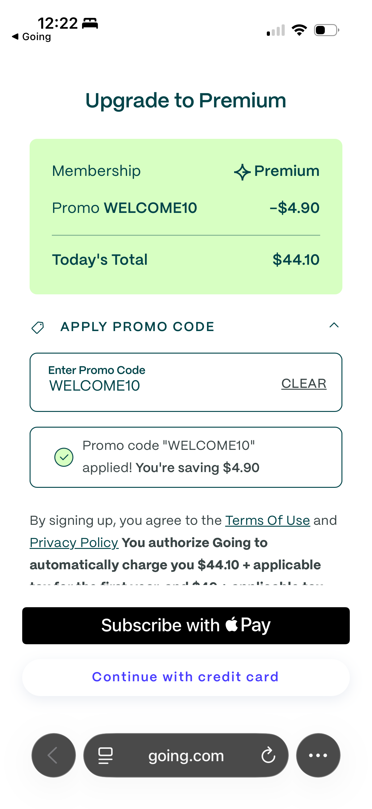
12:22 PM — the offer swap. The popup said SUMMER51. The web checkout arrives pre-filled with WELCOME10: −$4.90, total $44.10. That's 10% off $49 — and $5 more than the $39 the website offers everyone.

The consent copy is thorough; the trade is buried. Take the discount, and "no payment due now" becomes "charge you $44.10 + applicable tax for the first year" — due today. The Apple Pay sheet then slides over the fine print and won't scroll away. I tried.
Fix 2 of 3
One offer per user — persisted, and honored everywhere
Different campaigns on different surfaces is normal marketing. The same user meeting three numbers in one session is the problem. Persist the offer to the member's profile at first touch — whichever promotion they see first follows them from popup to paywall to web checkout to email, until it converts or expires, one offer per surface. Behind it, an offer ledger (code, value, expiry, redemption path) with a QA gate so no surface advertises what its checkout won't apply. And the discounted trial should keep the trial's promise: authorize the card now, charge on day 14. "10% off" shouldn't secretly mean "pay today."
03 — The First Session as a Member
I started a Premium trial. The app kept selling me Premium.
The good news is real. The red dot on the Alerts tab pulled me straight into the push-permission flow, and the pre-permission modal ("Be the first to know when new deals or flight prices drop") is exactly how you protect an iOS opt-in rate. The deal pages are clean, and the "Try Elite" cross-sell sits in the right place.
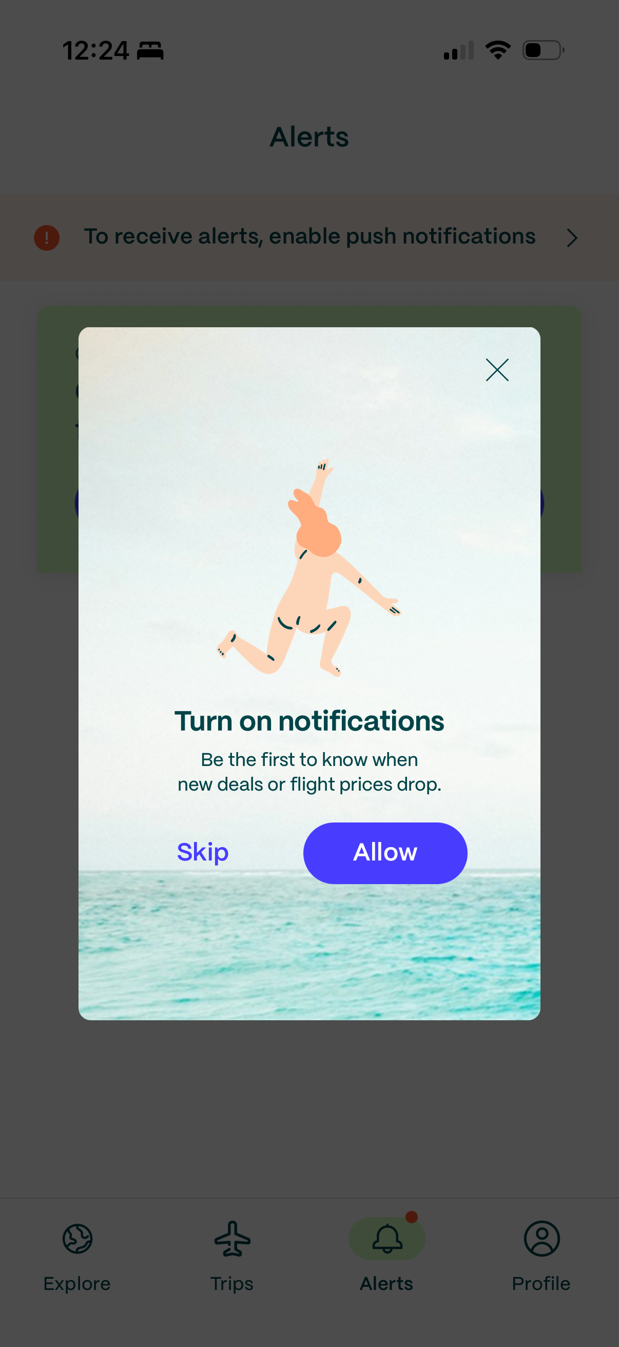
Done right: unread-dot → Alerts tab → value-framed pre-permission modal → OS prompt. This is the pattern.
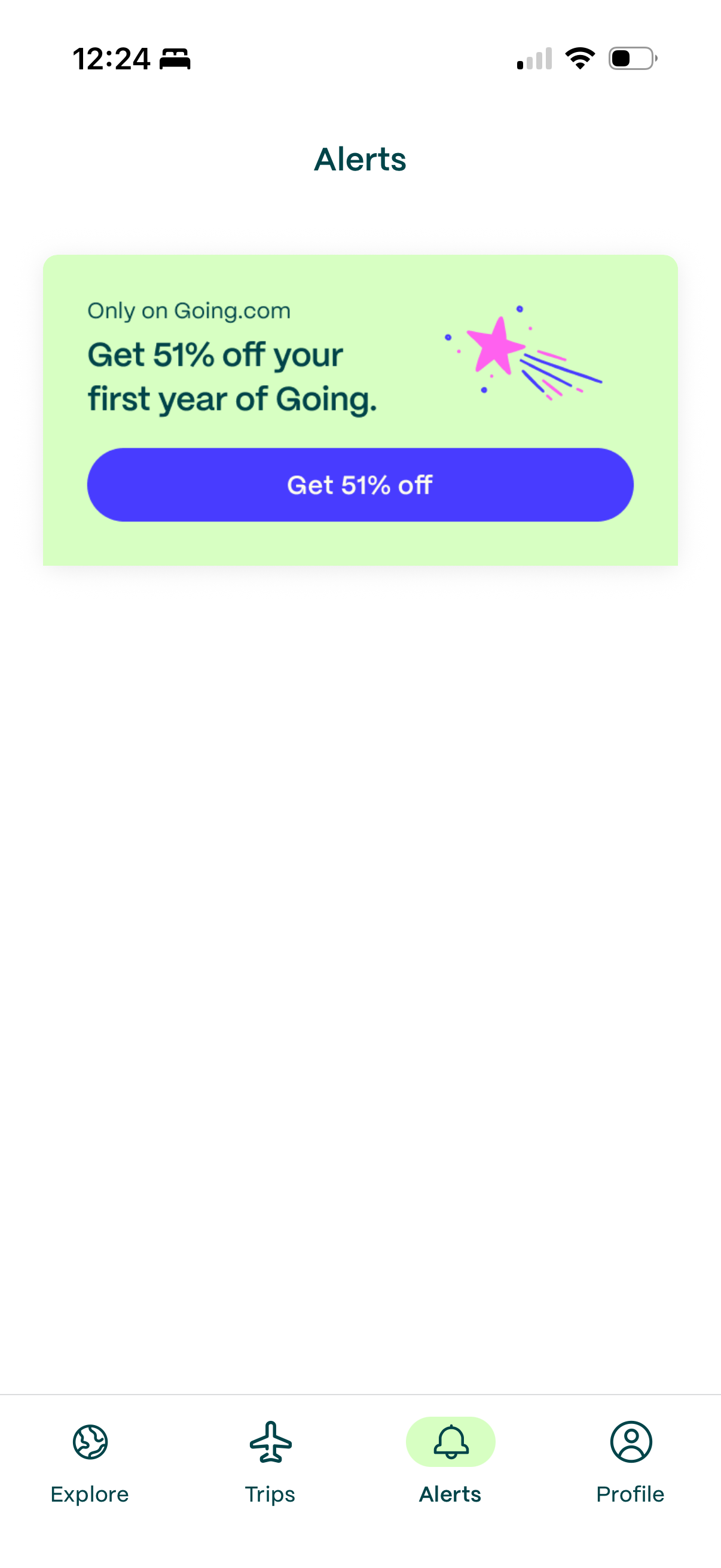
Done wrong: the first item in my Alerts feed — minutes into a Premium trial — is "Get 51% off your first year of Going." Not "of Going Premium" (the copy names the company, not the product), not suppressed for trialists, and tapping it dumps me on mobile web behind a "Continue in app" interstitial. An app alert, selling a web-only offer, bouncing back toward the app.
The set-alert screen and deal feed are identical for every user. But Going knew things about me before I opened the app — the ad I clicked, the page I landed on, the referral path. None of it shapes module order, headline, or the domestic/international lean. Wire Branch or AppsFlyer into the CRM and the acquisition signal decides what the first session leads with — the difference between a paywall that presumes "international" and one that knows.
Fix 3 of 3
Segment the surfaces by lifecycle state and acquisition signal
Trialists should never see acquisition offers — gate that alert on trial-state in Braze and swap it for "your Premium benefits, one per day" activation cards. Order onboarding modules by attribution data (deep-link source, ad creative, referral). The Alerts feed is the app's one owned inbox; every mis-targeted card trains members to ignore the channel mistake-fare revenue depends on.
04 — The Web
The website is a better lifecycle marketer than the app.
Web onboarding opens by asking for my home airport — the highest-value preference data there is, captured before any pitch. It's the thing reviewers praise by name ("I'm not receiving alerts from airports that are 6 hours away"). The upgrade page states the price like it's proud of it: Premium $39 first year (20% off, sale countdown), Elite $149 — the tier the app never mentions. If the app's funnel converted like whoever built this page, this postcard would be shorter.
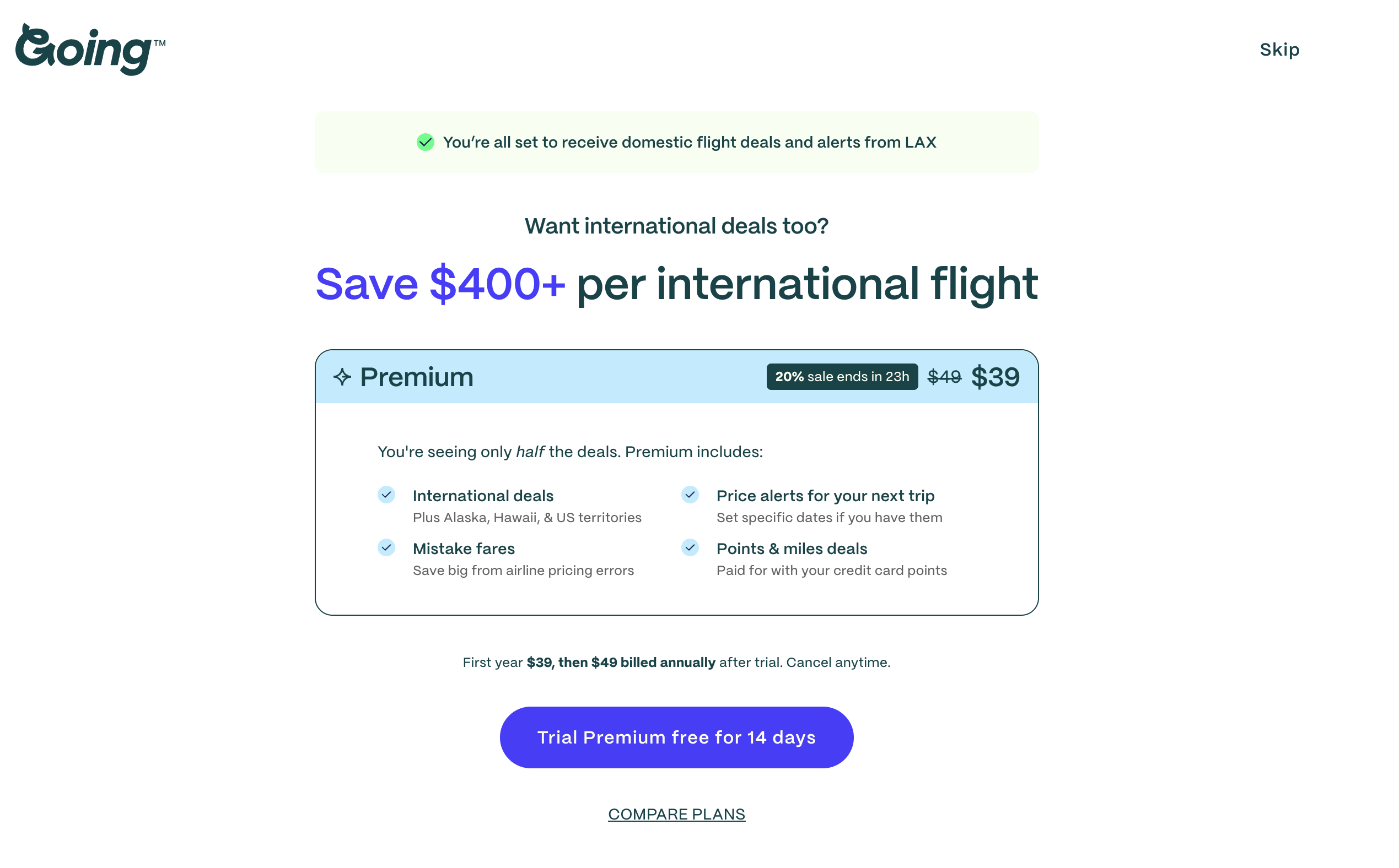
Clear anchor, clear price: "You're all set to receive domestic deals from LAX. Want international too?" Then $39, plainly.
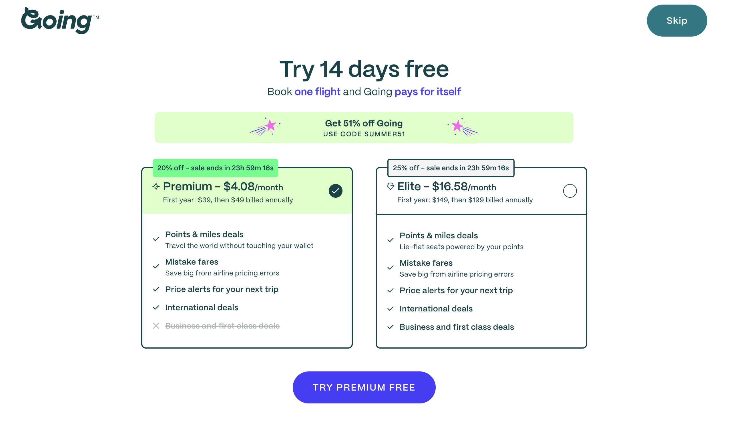
But the ladder collides even here: a "Get 51% off — USE CODE SUMMER51" banner sits directly above cards badged "20% off" and "25% off," with no rule for which wins. Three offers, one viewport.
The seams show everywhere. The app says "Alerts"; the web says "watchlist" — one concept, two names, so a member who sets one up on web can't find it in the app. A banner promotes a share button that lives buried in the hamburger menu under Profile. "On the Fly" is a good blog nothing labels as a blog. And the two programs that should be retention engines — Perks (partner discounts I only learned about from my payment receipt) and referral, parked at /settings/invite-friends — are interred in the footer, where growth loops go to die.
05 — The First Hour of Email
The confirmation was instant. The welcome took 15 minutes — and didn't know who it was talking to.
I ran the inbox test on both accounts: one that upgraded to Premium, one that stayed free.
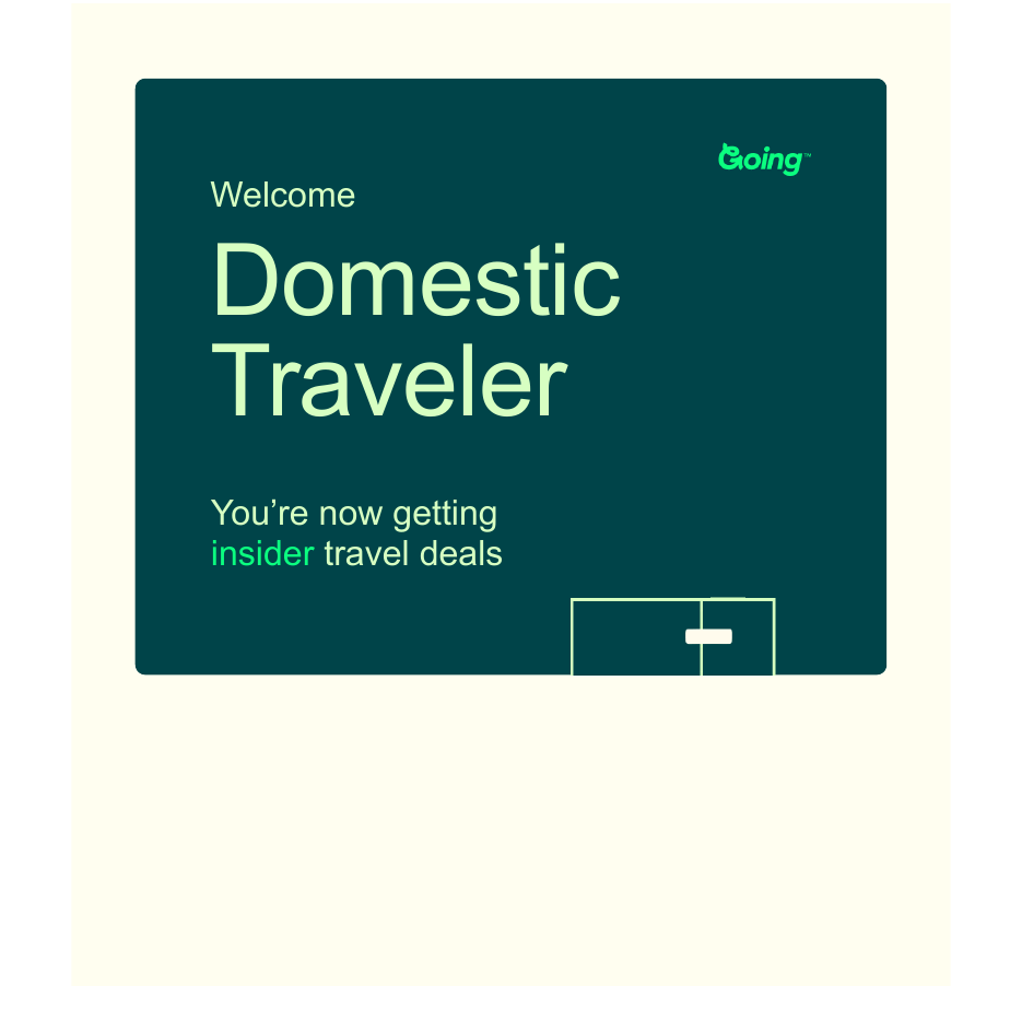
"Welcome, Domestic Traveler." I set LAX as my home airport and did nothing else. That's not a greeting — it's a segment label leaking into the hero, inferred from one data point, labeling me by the one thing an upgrade exists to change.
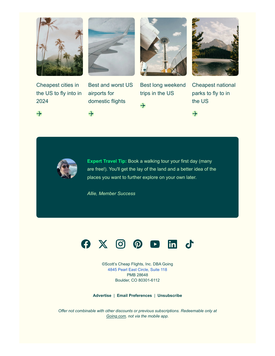
The footer confession: "Offer... redeemable only at Going.com, not via the mobile app" — the sentence that explains the entire app-to-web detour, printed where no one reads. Above it, guides dated 2024.
Two emails expose three disconnected systems: a transactional trigger that fires instantly, a marketing automation that fires 15 minutes late and greets by segment label, and an offer engine neither consults. The welcome is the program's one guaranteed-open send — reviewers describe joining because an email asked them to. Spending that open on a leaked label and 2024 listicles spends it on nothing.
This inbox also has history: 358 Scott's Cheap Flights and Going emails since July 2018, through the founder-newsletter era, the 2021 relaunch, and the rebrand. Three patterns from the archive belong here.
06 — The Public Record · Context, Not Verdict
Going already fixed its worst lifecycle problem once. That's the encouraging part.
The abandoned Scott's Cheap Flights Trustpilot page reads like a warning label — 1.6★, 95% one-star, silent auto-renewals, "spam almost instantly," no path to cancel. The going.com page today: 4.5★ across 814 reviews, with renewal-day cancellations and proactive refunds now showing up as five-star praise, and an 87% reply rate on negative reviews. App Store 4.7★, Play 3.6★. The billing rage that defined the old brand was engineered away after the January 2023 rebrand.
The current set of complaints is next on the docket, and it rhymes with everything above:
- Deal emails called "deceitful click bait" for preview text that isn't in the body (March 2026, acknowledged by Going).
- Mistake-fare push alerts that crash to the world map, both platforms, through April 2026 — the highest-intent moment in the lifecycle, failing at the deep link.
- Apple Pay looping at trial signup (January 2026).
- Web-created trips invisible in the app (August 2025) — which my test reproduced as the web/app offer and naming split.
- And the oldest theme in three years of reviews: "deals for places I'm not going, dates I can't use." A personalization problem in a deal-quality costume.
07 — What I'd Fix First
Five fixes, in priority order.
The root cause behind most of this list: the website was the original service, the app is the newer build, and the two were never joined. Trips, tiers, offers, even feature names live separately — and Going's own review replies blame charged-after-cancel complaints on duplicate accounts under different emails. That's the signature of a missing identity layer and no single owner of the cross-surface experience. Each fix ships on its own; they stop being whack-a-mole once someone owns both surfaces and the profiles beneath them.
