- The Pop-up — a quiz that knows why I'm here, and never uses it
- The Landing Page — everything works, all at once
- The Cart — three gifts nobody mentioned upstream
- The Pay Button — two countdowns before the receipt
- The Inbox — four systems, four voices, two hours
- The Member Page — a streak without stakes, a tier without an intro
- The House of Ü — I tested all four brands; the funnel is a franchise
- What I'd Fix First — five fixes, in priority order
01 — The Pop-up
The quiz asked exactly the right question. Then nobody listened to my answer.
This is a well-built capture flow opening with "To claim, share what problem you're trying to solve", with "I'm on a GLP-1 but I don't feel great" as the first option. That's segmentation at the front door, before the first pageview is even warm. Then email, then SMS, then a "Discount Applied!" screen that pre-empts the where's-my-code support ticket.
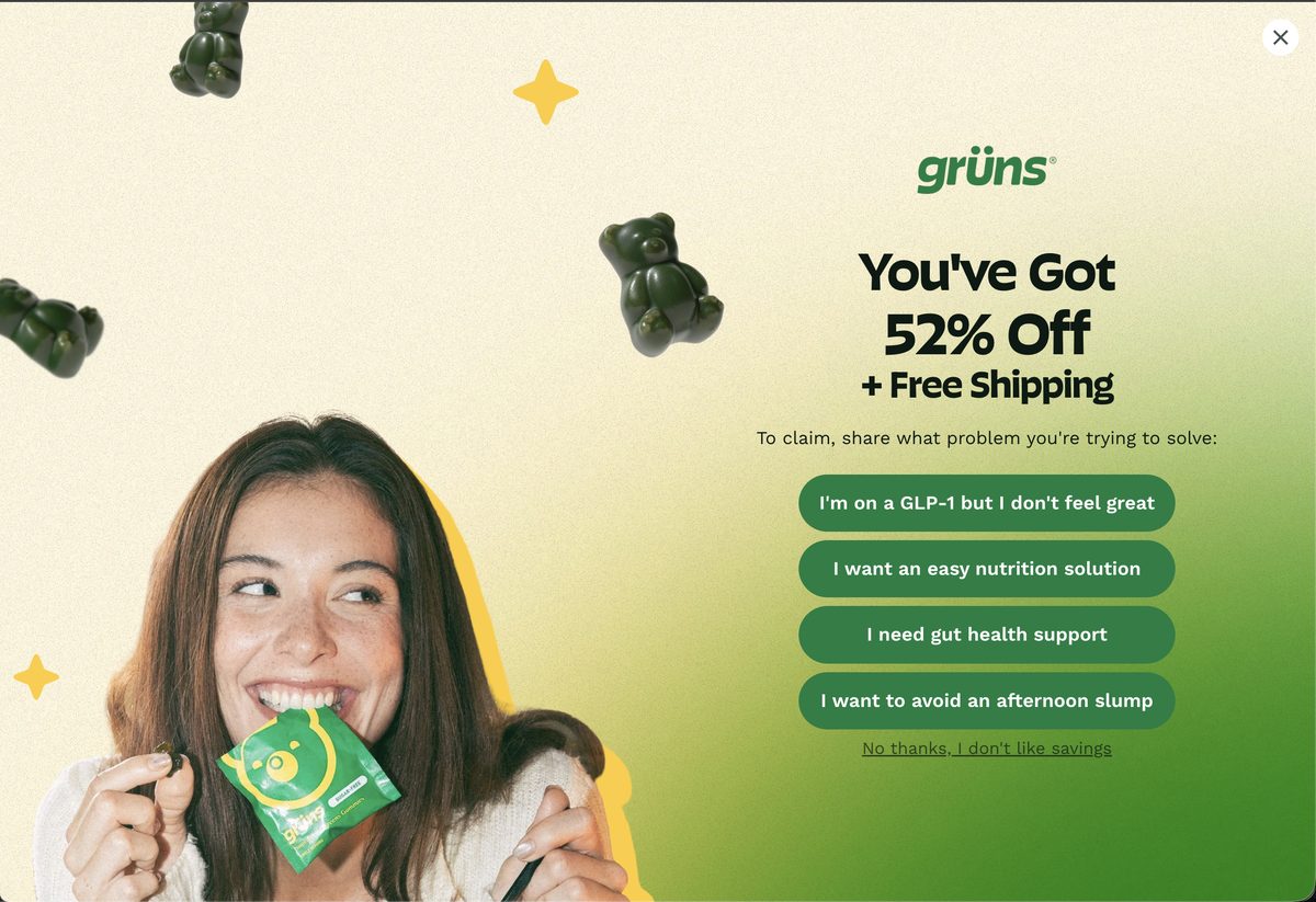
Step one — the best question in the funnel. Four problems, GLP-1 first. I answered — remember my answer, because Grüns won't.
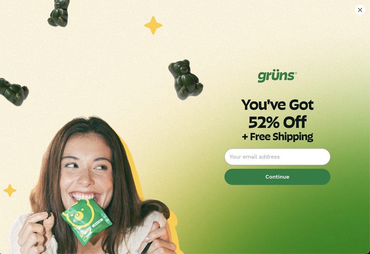
Step two — "You've Got 52% Off." Granted, not conditional. Good instinct. Hold that number.
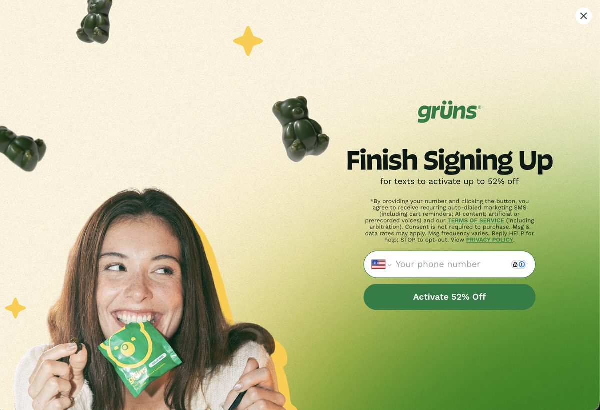
Step three — the quiet hedge. "52% Off" becomes "up to 52% off" one screen later. Small words, but this is where the offer ladder starts wobbling.
Two misses. First, the answer changes nothing: pick GLP-1, gut health, or afternoon slump and you land on the same page, scrolling to find your reason to believe. Second, the quiz doesn't show that Grüns sells to two buyers — shopping for adults or for kids. There's no "this is for my kid" branch, even though a dedicated kids PDP with its own pricing exists one click away. And the destination page? It greets my "52%" with a banner shouting "SAVE UP TO 61% + FREE GIFTS." I haven't bought anything yet and I've already been quoted two numbers.
Fix 1 of 3
Route on the answer — kids vs. adults first, then the problem
Question one: who is this for — you, or your kid? That alone routes to the right PDP and the right price. Question two: the problem quiz, with options that follow the first answer — adult problems for adults, kid problems (picky eating, fiber, immunity) for parents — with each answer deep-linking to the section of the page that handles that objection: GLP-1 answers land on the "Eat Less. Miss Nothing." story, gut-health answers land on the prebiotic module. The quiz already exists. The pages already exist. Only the wiring is missing — and the pop-up's number should be the page's number.
02 — The Landing Page
Almost everything on this page works. That's the problem — it's all working at once.
Individually, these are some of the best conversion modules I've seen in DTC wellness: a nutrition-label drawer with third-party testing dated this month, review filters mapped to key value props (Taste / Value / Vs Powders / Benefits), a what-to-expect timeline that pre-frames 3 renewal cycles, a 12-week clinical study with real biomarker lifts (+20.5% folate, +40% vitamin C), and an "Us vs. Them" grid that does the math against a $3.60-per-serving green powder. Somebody here deeply understands why people don't buy vitamins.
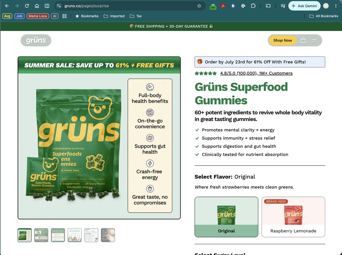
Three offers in one screen. "FREE SHIPPING + 30-DAY GUARANTEE" (banner), "SUMMER SALE: SAVE UP TO 61% + FREE GIFTS" (image), "🎁 Order by July 23rd for 61% Off With Free Gifts!" (dashed box). I arrived holding a 52% off promise. The deadline is today's date — evergreen urgency wearing a calendar.
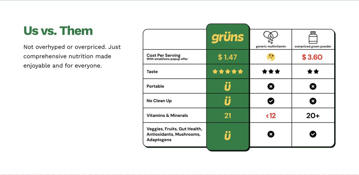
The grid that does the math — $1.47/serving vs. $3.60 for the unnamed green powder. Read the fine print: that $1.47 only exists with the pop-up discount applied. The page's whole value claim is built on the welcome offer — so when the offer number wobbles, the math wobbles with it.
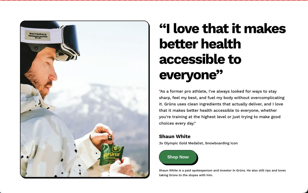
A 3x Olympic gold medalist, buried below the fold count. The Shaun White section is warm, credible, and honestly disclosed ("paid spokesperson and investor... he also still rips"). It's also beneath the flavor promo, the timeline, the grid, and five Shop Nows. The best story on the page is the last thing you meet.
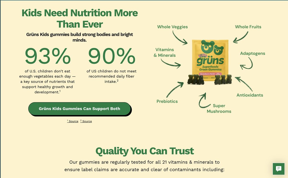
The kids page shows the way. Two cited stats (93% of kids under-eat vegetables, 90% miss fiber), a four-benefit grid, press proof, one offer. Simpler, calmer, easier to believe.
Fix 2 of 3
Compress the page, promote the story, anchor the segments
Keep every module's job but cut half of its words: one review wall (not visual + text + tags), one offer, the comparison grid tightened to four rows. Move Shaun White and the clinician badge into the first two screens — story and proof before the third discount mention. Then use the quiz: GLP-1 answerers get anchored straight to the section built for them instead of a scroll test. The kids page proves the team can do compact; the adult page just never got the same edit.
03 — The Cart
The cart handed me three gifts I never saw coming — because nothing upstream mentioned them.
I opened the cart and found "Your Cart (4)" — with one paid item. A $10 Wellness Guide, an Apple Watch giveaway entry, and a $15 ÜSnacks sampler had joined on their own. Generous! Also wasted: free gifts persuade before the decision, not after it. Surfaced at the add-to-cart moment, they're a reason to say yes. Discovered inside the cart, they're clutter — and their "value" quietly inflates the discount math (that's how 49% becomes a 61% badge).
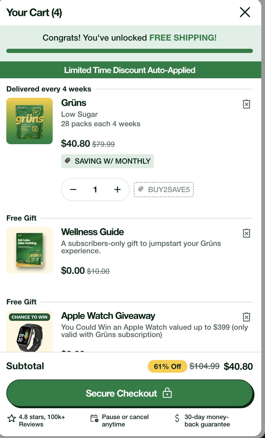
"Your Cart (4)," one product. Wellness Guide ($0.00, was $10), Apple Watch giveaway ("CHANCE TO WIN"), sampler below. A sweepstakes entry rendered as a cart SKU. The gifts deserve a stage; they got a line item.
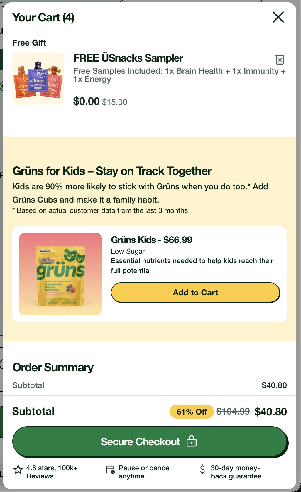
The forgotten cross-sell. "Add Grüns Cubs and make it a family habit" — at $66.99, full price. Fourteen minutes earlier the kids PDP quoted me $32.46. Same session, same product, double the price — and the copy can't decide if it's "Grüns Kids" or "Grüns Cubs." The retention stat is great: "Kids are 90% more likely to stick with Grüns when you do too." Lead with that proof at the real price — knowing that households who buy for everyone were always going to stay longer.
The elements are good — free-shipping progress bar, itemized order summary, pause/cancel and guarantee restated at the button. This is a sequencing problem, not a design problem: the right elements meeting the customer at the wrong moment, with arithmetic that doesn't survive a screenshot comparison.
04 — The Pay Button
After I paid, Grüns kept selling — two countdown timers before I saw my receipt.
The subscription disclosure is the most honest I've tested this year: plain language about auto-renewal, a promised shipping reminder 3 days before billing, cancel instructions with an email address, and a dedicated Cancellations link in the footer. Whoever wrote that understands that billing surprise — not price — is what kills subscription brands. Then I clicked Pay, and the tone changed.
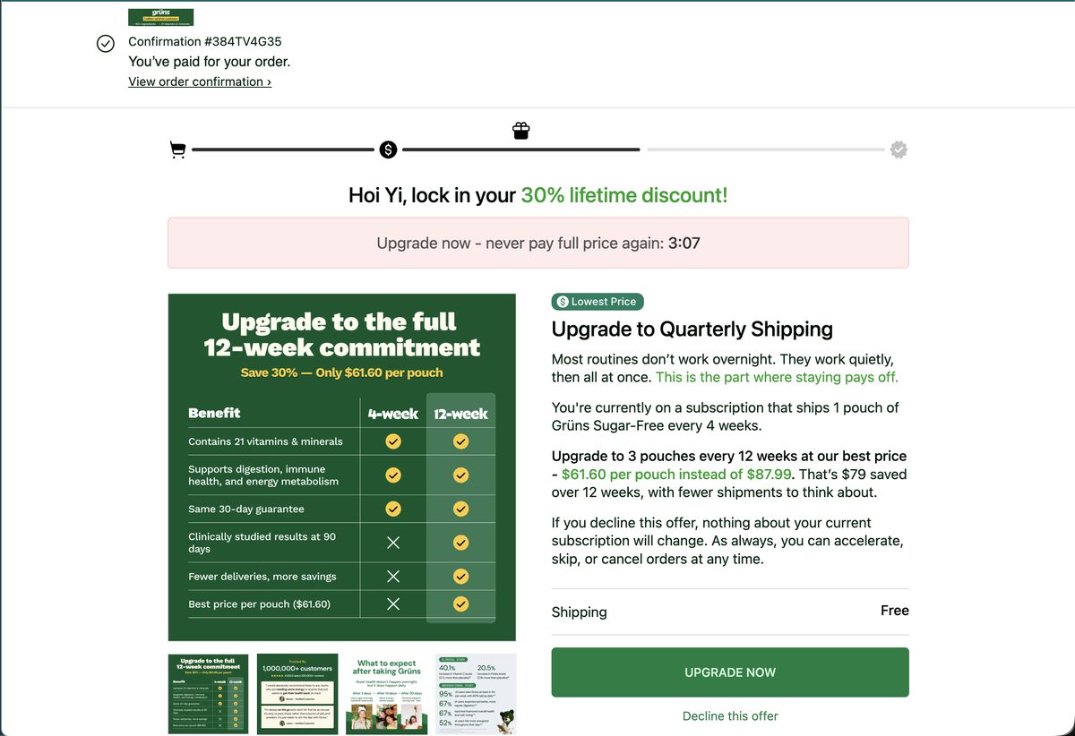
Upsell one, countdown ticking. "Lock in your 30% lifetime discount!" against an $87.99 anchor no prior screen ever showed. I took it — the quarterly logic is genuinely sound.
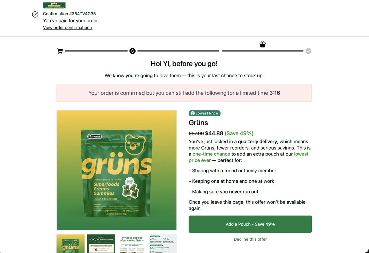
Upsell two, new countdown. "Last chance... lowest price ever": $44.88 — which is, to the penny, the discounted subtotal I'd just paid. The superlative is technically a tie.
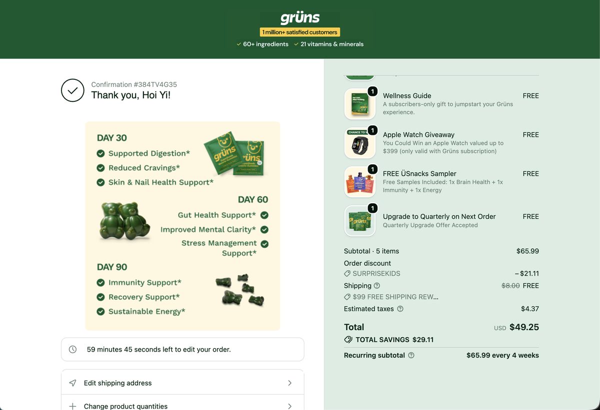
The confirmation page. Day 30/60/90 expectations planted at minute one — the reason to stay subscribed, delivered before the first doubt — with the 60-minute edit countdown already running.
Two timed offers between payment and confirmation read like a food-delivery app, not a wellness brand a parent just decided to trust — and for a first order, the sequence spends some of the trust the checkout disclosure just earned.
05 — The Inbox
Two hours of email, four different Grüns — my inbox met a brand with multiple personalities.
Here is the entire first day of email, in send order. Watch the sender column as closely as the subject lines.
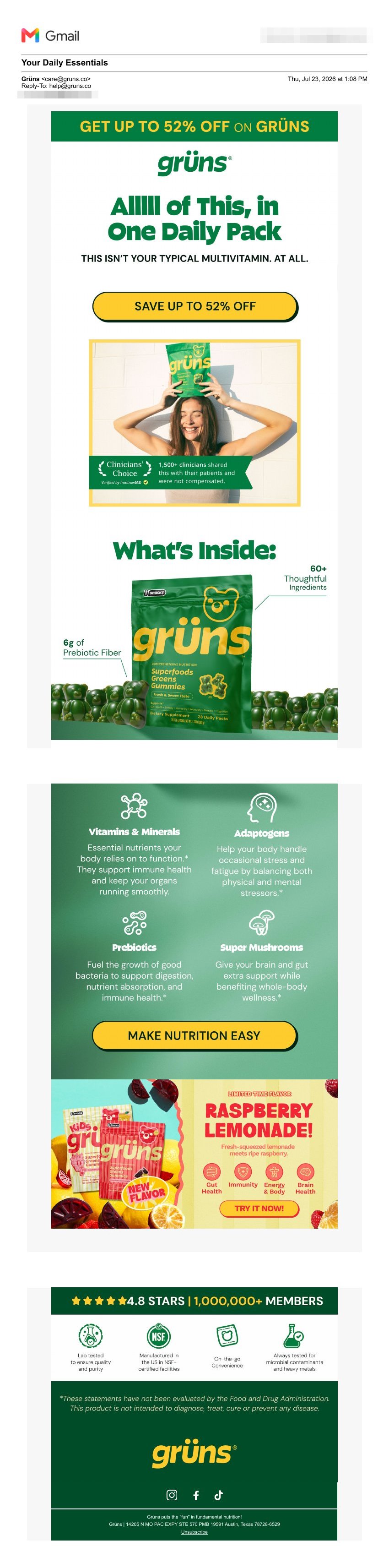
The welcome (scroll it). Gorgeous production. The order is the problem: discount → logo → headline → clinicians → then what's inside and why it's different. Flip it, and the discount becomes the closer instead of the opener.
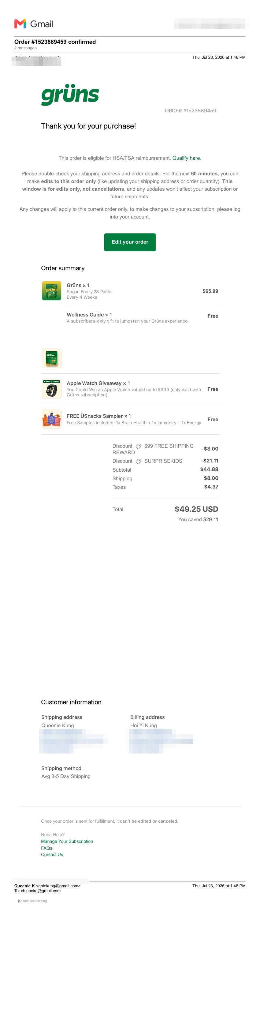
The confirmation. Functional, honest, cold. "Thank you for your purchase!" then straight to logistics — no celebration of what makes this order unusually generous, no distinction between a one-time buyer and someone who just committed to a subscription.
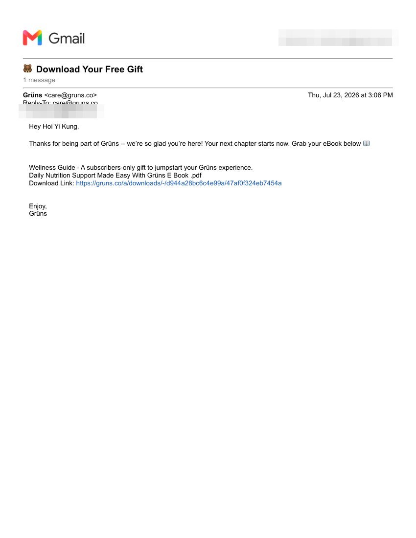
The gift delivery. This is the entire email. For a brand whose welcome uses custom display type, this is what a subscribers-only gift arrives in — 80 minutes late, unbranded top to bottom.
Fix 3 of 3
Rebuild the first 24 hours as one voice
Welcome, within five minutes: celebrate the decision — one headline, what's in the pack, why it's different — with the discount as the CTA, not the opener. Welcome two: the proof story — 1,500 uncompensated clinicians and Shaun White, the two best assets currently buried mid-email and bottom-of-page. Order confirmation: a celebration that names the gifts and attaches the Wellness Guide on the spot — killing the 80-minute plain-text straggler entirely. Skip trigger: one human question ("what made you skip? — reply and a person reads it"), signed by a name from CX. Referral: white-label the domain, and hold the ask until the first delivery lands. One sender, one reply-to, one design system across all four platforms — they all support it; it's config, not engineering.
06 — The Member Page
I became a "Green Gummy" with a one-month streak. Nobody told me what either is worth.
The member dashboard is gamified: a status badge (GREEN GUMMY), a six-node order streak with a flame, a golden tier ("UPGRADE TO GOLDEN GUMMY"), and a members-only VIP Pass. The mechanics are all there. What's missing is the meaning: I was never introduced to any of it before purchase, the streak's locked nodes never say what unlocks, and "Golden Gummy" turns out to be quarterly shipping wearing a crown — the same upgrade I'd already accepted an hour earlier, still being pitched to me as if I hadn't.
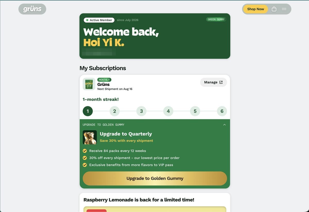
Status without a story. "GREEN GUMMY," "1-month streak!", "UPGRADE TO GOLDEN GUMMY." Three terms, zero introductions — and the dashboard still labels me MONTHLY. The systems aren't talking here either.
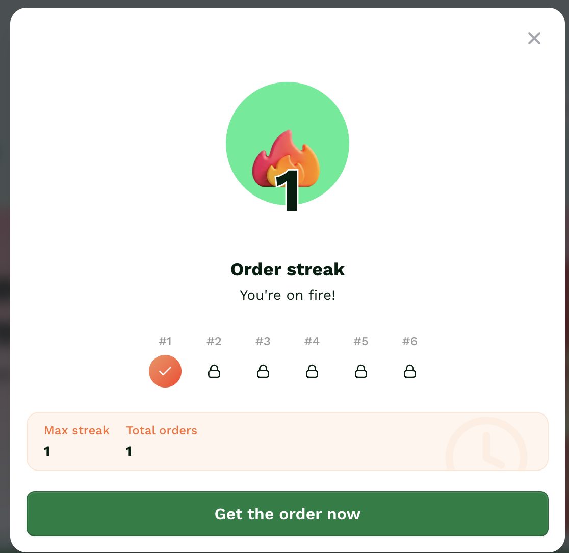
The streak. One padlock opened, five to go, and no stated rewards. "You're on fire!" — toward what?
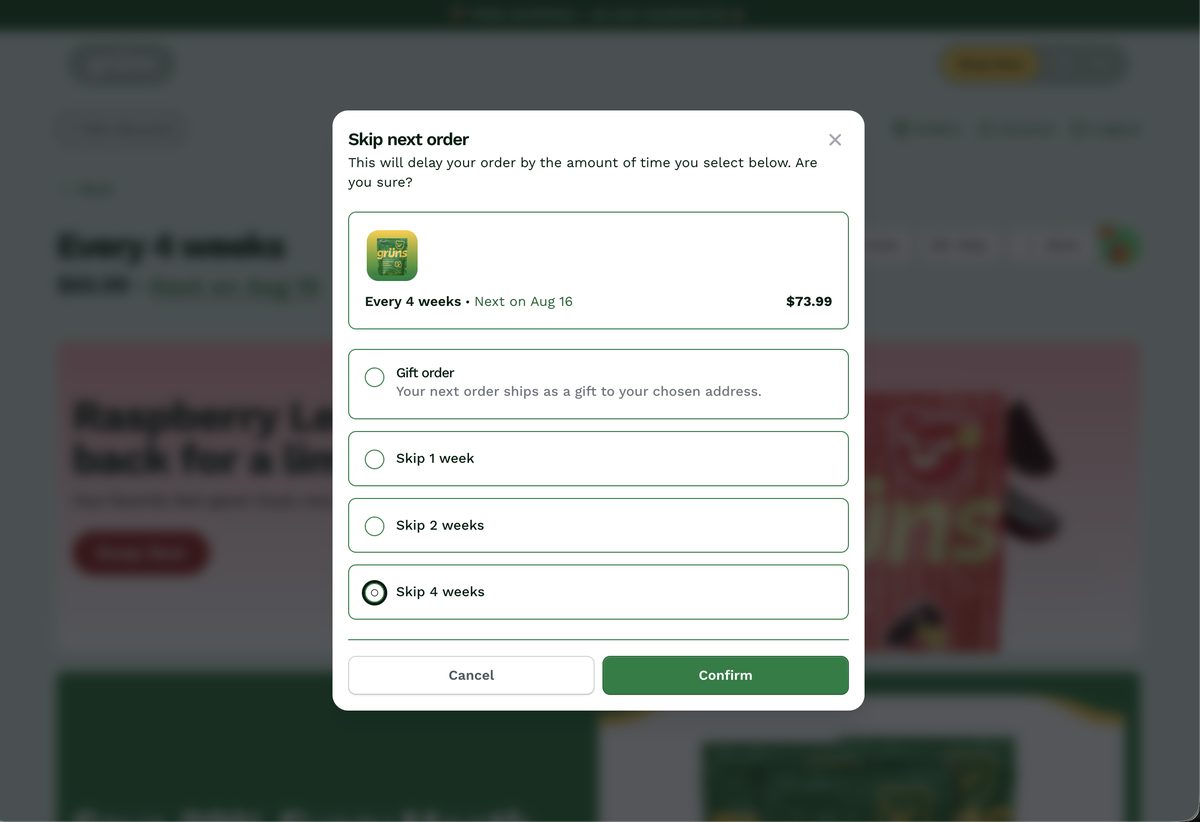
The best retention UX is in the product. Skip is one click from the dashboard, and the modal deflects gracefully: gift the order, or skip 1–2 weeks before 4. No guilt screens, no dark patterns. (One discrepancy: the modal prices my order at $73.99; the page above says $65.99.)
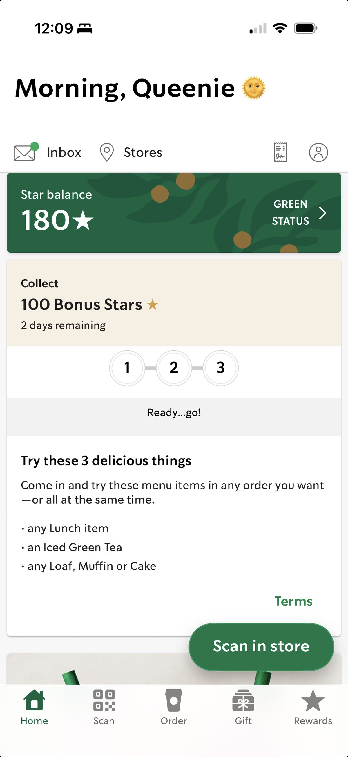
The comp. Starbucks Rewards: a balance I understand (180★), a status with a clear time-boxed challenge and a concrete prize. This is the page "Golden Gummy" should mirror.
The skip-first architecture is genuinely praiseworthy — easy pause beats a rage-cancel, and gifting-as-deflection is clever. But the loudest signal it generates (the skip itself) currently disappears into a confirmation email that asks nothing. And at the bottom of my logged-in, already-paying member dashboard sits a footer offering "Sign Up for 52% Off" — a bigger discount than my subscription carries, and real estate that could have been used for cross-sell.
07 — The House of Ü
I signed up for all four brands in one afternoon. The same funnel greeted me four times.
The funnel is a franchise with efficiency in mind. Same pop-up architecture on every brand: email, segmentation quiz, SMS, then a "Check your texts! In the meantime, here's your big welcome offer... don't close your browser!" screen — that sentence is verbatim identical on Immün and Jüced. Every brand then routes to the same /pages/surprise offer page.
And every brand inherits the same two bugs. The quiz answers still change nothing — Nütrops asked if I wanted Memory, Focus, Mood, or Energy; Immün asked about travel and seasonal illness; Jüced asked about my gym goals; all four brands sent every answer to the same page. The offer wobble is consistent too: Jüced's pop-up promises 52%, but the solo plan prices at 49% — 52% requires buying for two people. Immün runs it in reverse: 55% solo, 44% for two.
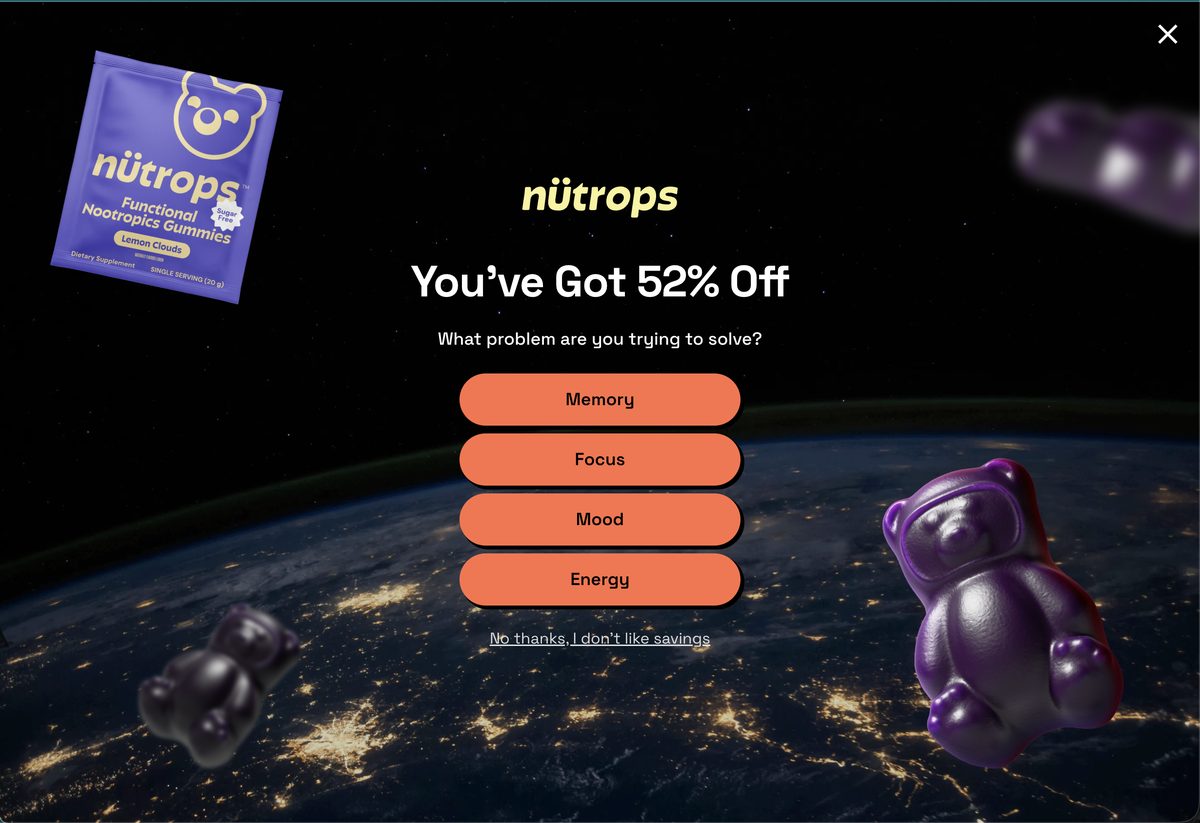
Nütrops. "You've Got 52% Off" — what problem are you solving: Memory, Focus, Mood, Energy?
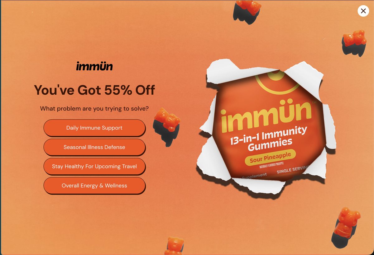
Immün. Same architecture, different number — 55% here, 52% everywhere else.
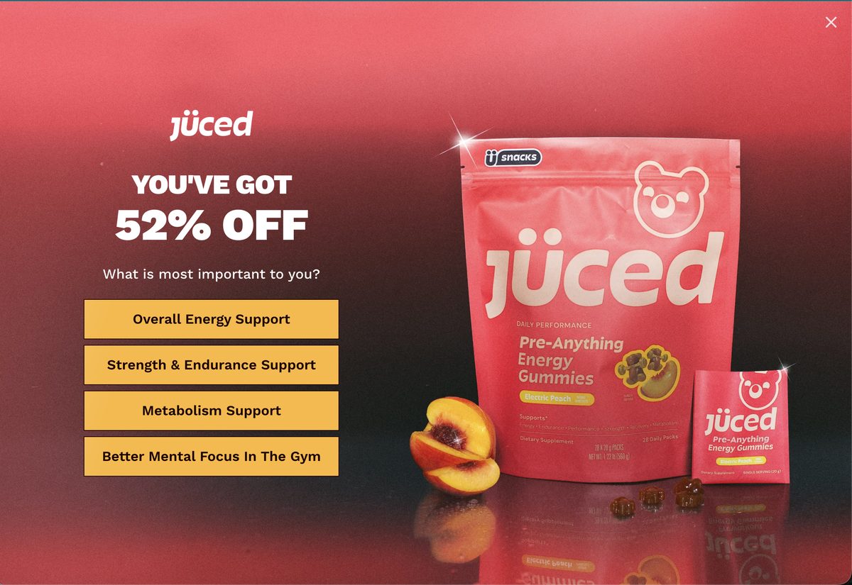
Jüced. "You've Got 52% Off" — then the buy box prices the solo plan at 49%.
The newer brands' landing pages are tighter and more persuasive: one hero claim, one social-proof line, one buy box, one offer per page — and reviews merged into a single module where Grüns runs two. Whoever builds these pages is iterating brand over brand, and it shows.
The lifecycle template isn't getting the same treatment: each new brand ships the same welcome-email skeleton — hero, "GET UP TO 52% OFF" button, 30-day risk-free lockup, same Austin address, same care@<brand>.co pattern — with the social proof degrading by brand age. Grüns cites 1,500+ clinicians and a million members; Nütrops cites a survey of 100 respondents; Jüced cites five star glyphs and vibes. And Immün never sent a welcome at all — the photocopier skipped a page. The acquisition playbook evolves with every launch. The lifecycle playbook gets photocopied.
The trigger emails clone the same way: thirty minutes after I left each site, all three new brands sent the same browse-abandonment skeleton — none of them using the quiz answer I had just given or the products I had looked at. And Nütrops' only call to action is "KEEP BROWSING" — an abandonment email whose big ask is more window-shopping.
Day two doubled down: four discount-led emails in roughly 24 hours isn't a welcome journey — it's the same offer wearing four outfits. Volume can work, but only if the content differentiates: proof in one send, story in another, the discount as the closer — not the opener, four times in a row.
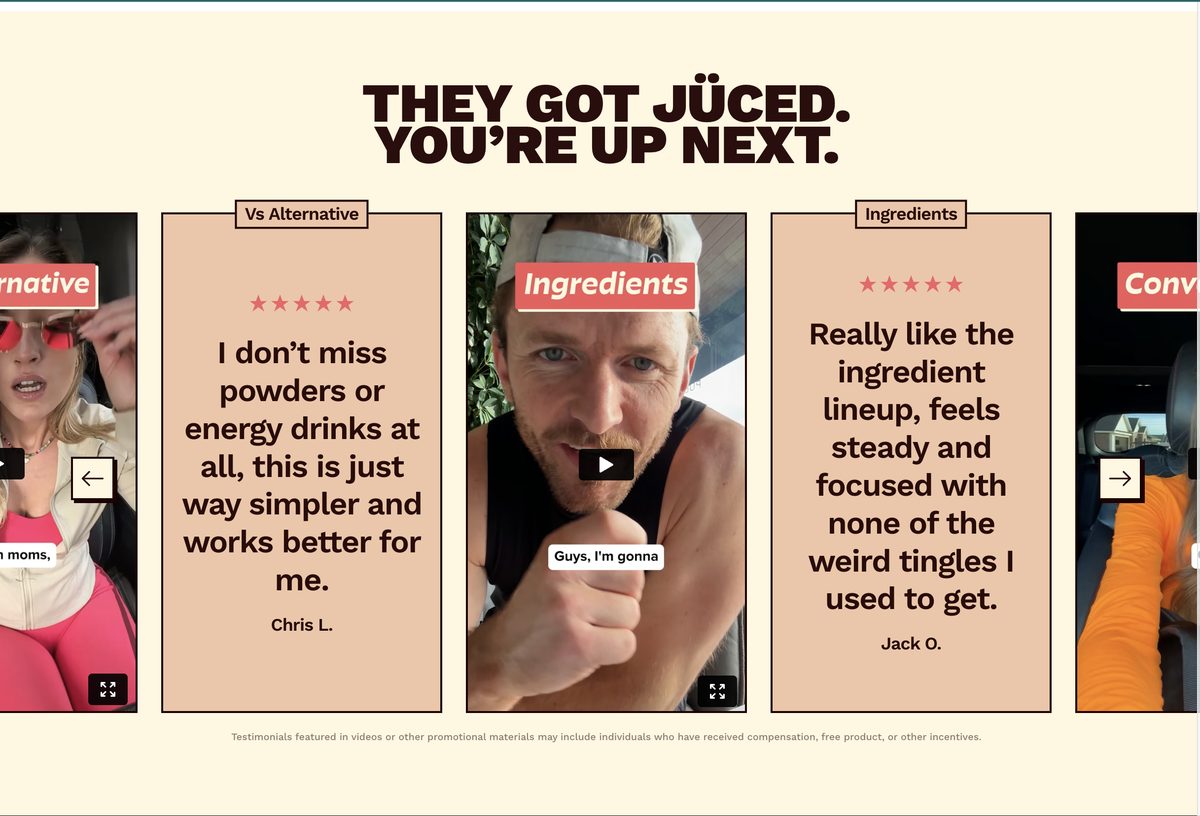
What "cleaner" looks like. Jüced interleaves text quotes and UGC video in one carousel under one headline — the compact version of the two separate modules on the Grüns adult page.
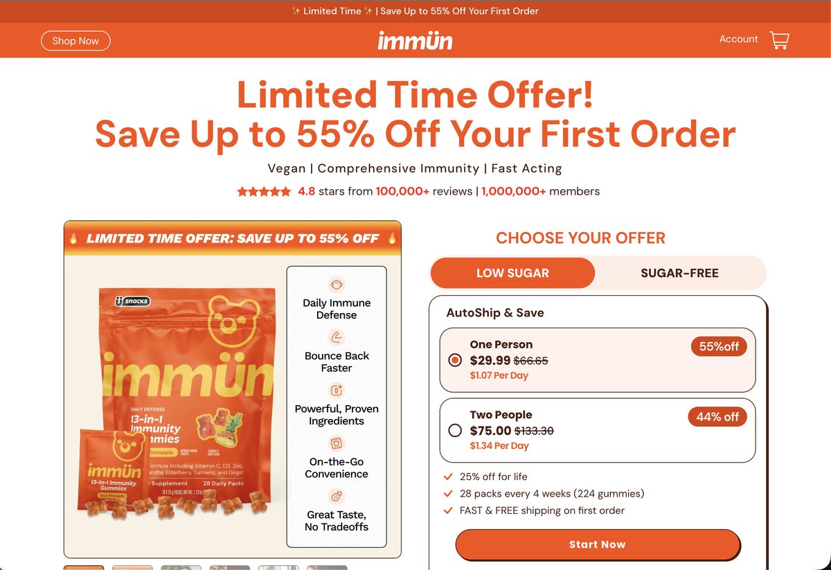
Immün's PDP top: one claim, one proof line, one buy box, one offer (repeated, not competing). The adult Grüns page should study its little sibling.

Nütrops' welcome (scroll it): the Grüns skeleton in a space suit — hero, 52%, CTA, stats block, footer. The survey fine print discloses n=100.

Jüced's welcome: same skeleton in gym clothes — and the same discount-first lead as its three-year-old sibling.
08 — What I'd Fix First
Five fixes in priority order.
The root cause behind most of this list: acquisition was built test-and-evolve, and the lifecycle was assembled from four platforms' defaults. Klaviyo, Shopify, Skio, and Social Snowball can all be made to speak in one brand voice. What's missing is the conductor.
