- How to spot a program's strongest copy — and tell when it's in the wrong email
- What TCPA compliance looks like on a popup, and what missing it costs per text
- How to sequence story vs. discount in a welcome flow without losing the sale
01 — The Sign-Up Flow
Five screens to capture an email and phone number. Two broken. One non-compliant.
The pop-up has strong instincts — an urgency timer, an upsell hook, a progressive reward. But execution gaps undercut every one of them.
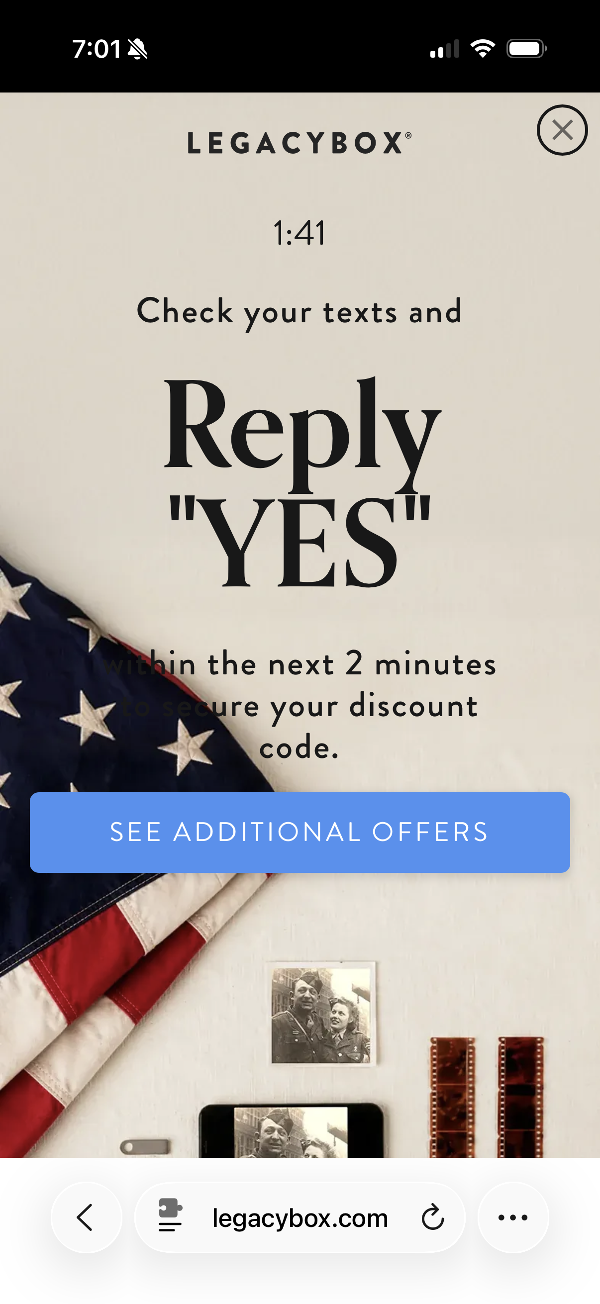
A 2-minute countdown creates real urgency. Strong mechanic. Issue: the text blends into the flag background — the most important copy is unreadable on mobile.
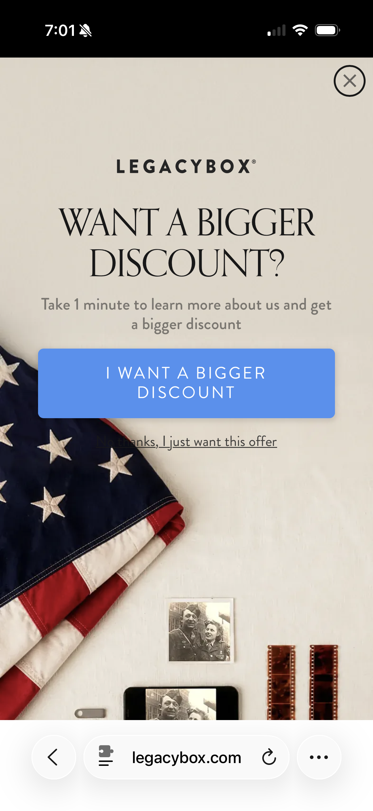
"Want a bigger discount?" is a smart upsell hook. Users self-select into a higher-value segment by sharing their phone number.
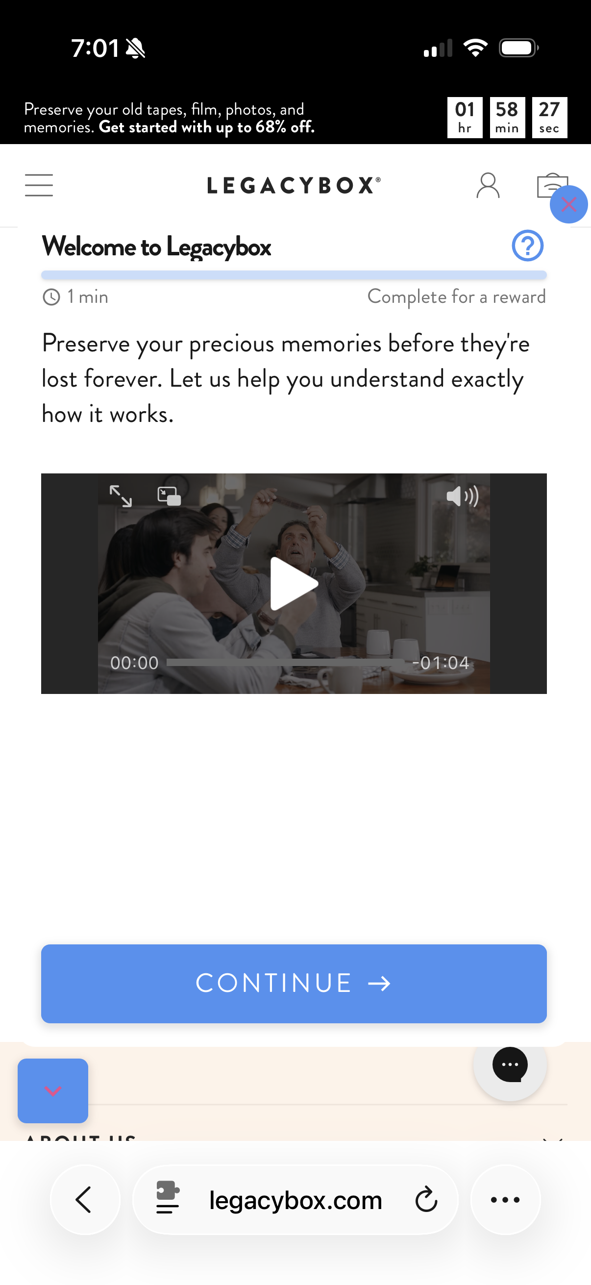
A 1-minute video as a gate before the reward creates drop-off at the highest-intent moment. The reward should come first.
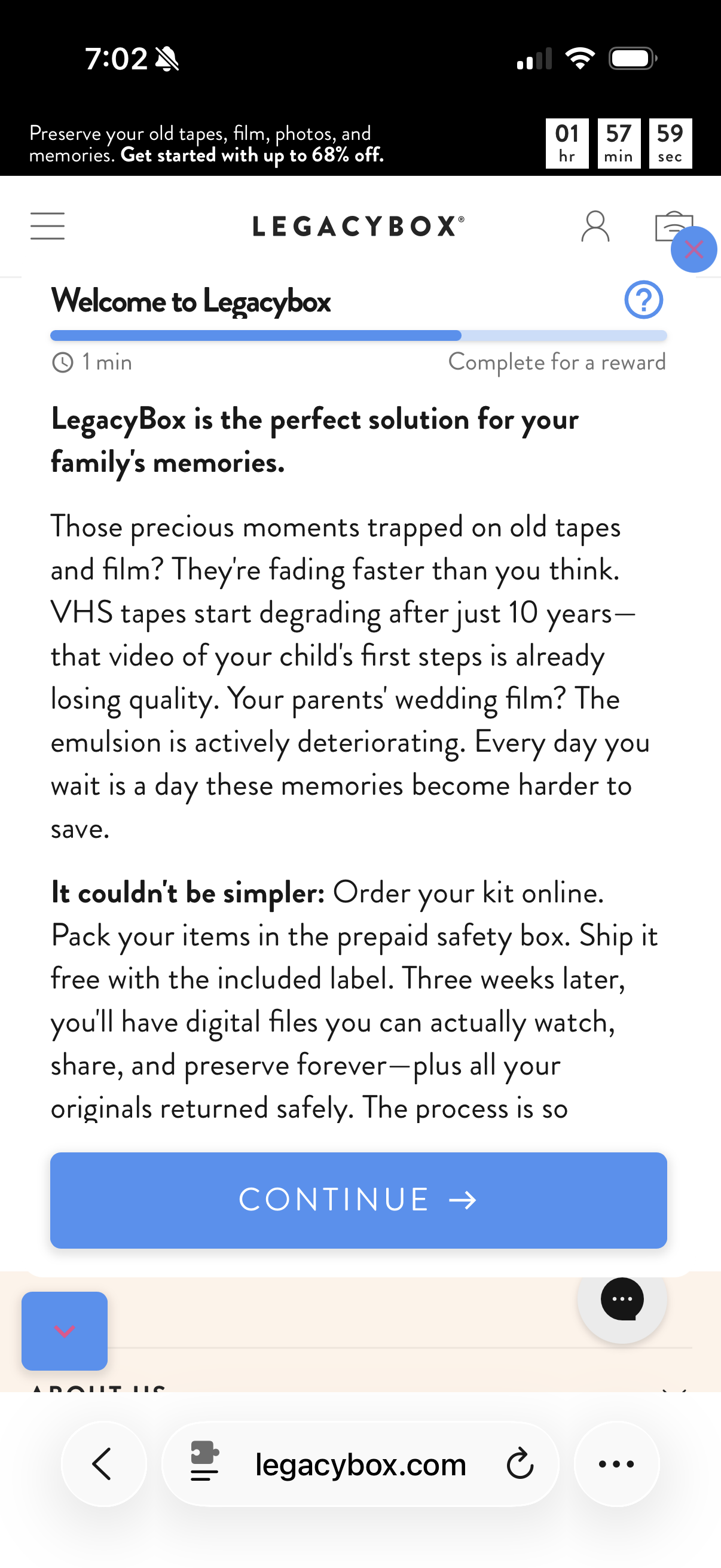
"VHS tapes degrade after 10 years" is the strongest copy in the program. It's on pop-up step 4. It should be in the welcome email subject line.
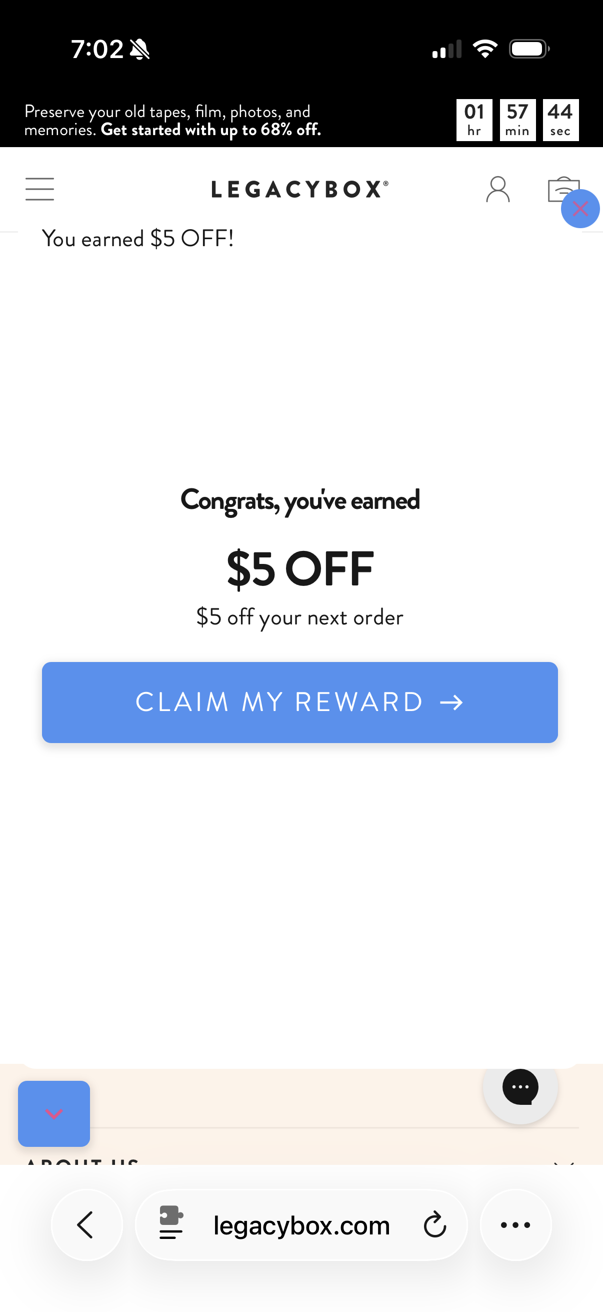
I completed all 5 screens and replied YES to the SMS — no code arrived. Every user who did this got a broken promise before their first purchase.
Fix 1 of 3
Add TCPA opt-in language before collecting phone numbers
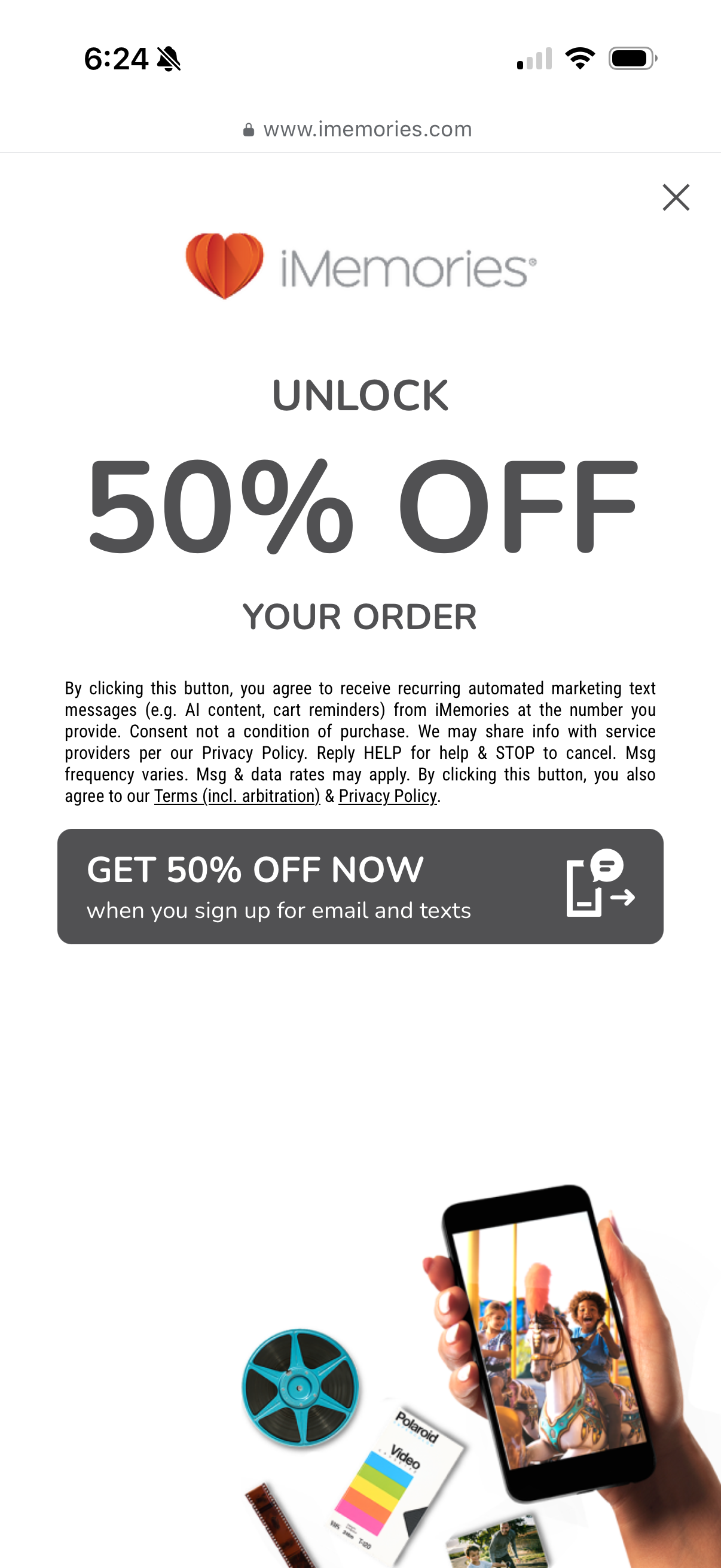
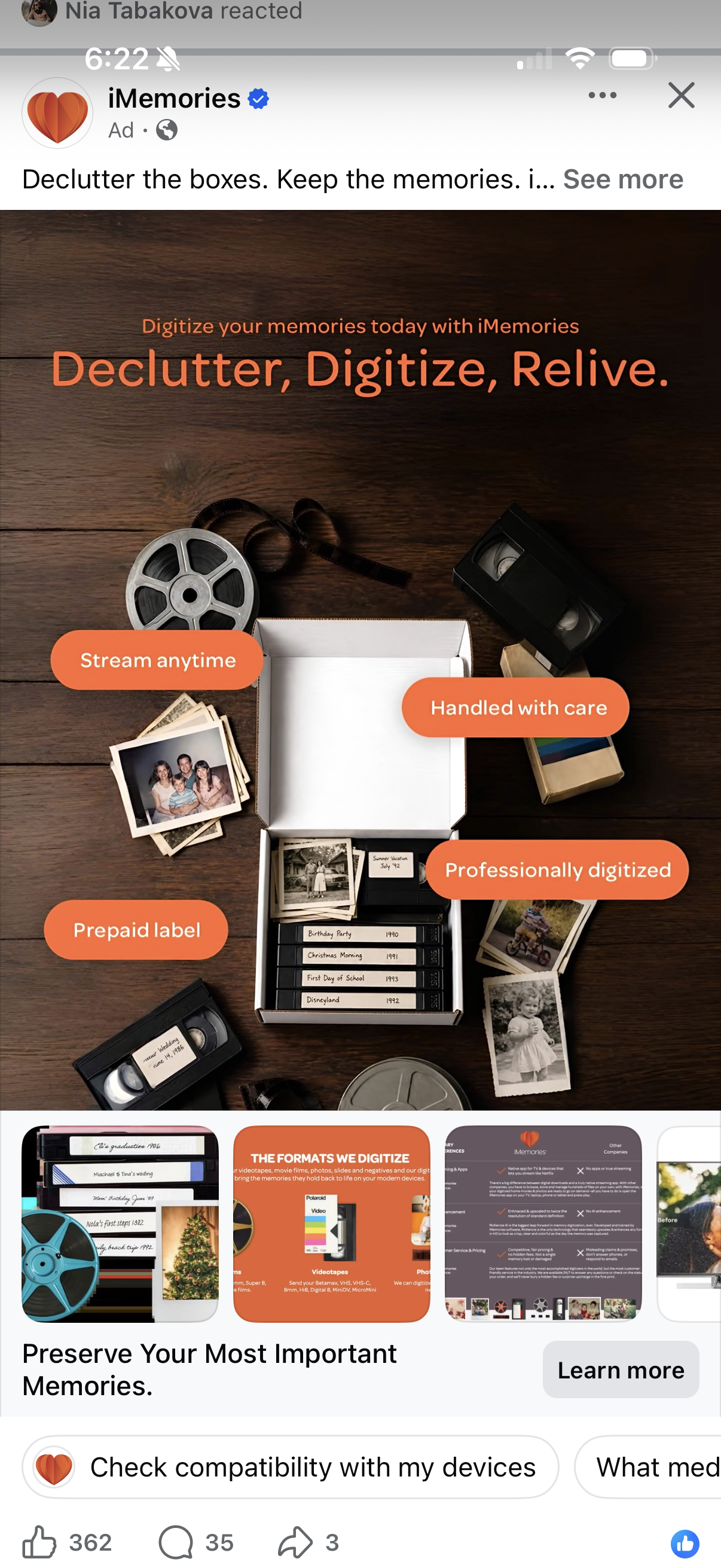
The flow collects phone numbers and asks users to reply YES with no required TCPA disclosure visible. This is a compliance requirement, not a UX preference — TCPA violations carry $500–$1,500 per text in statutory damages. One sentence resolves it, and iMemories, a direct competitor, has it right.
Fix 2 of 3
Invert the flow — reward first, education second
Currently users must watch a video and read a value-prop block before seeing the $5 off they were promised. The video is a nice brand touch — but it belongs after the reward is confirmed, not as a gate before it. Reveal the $5 off immediately after SMS sign-up, then offer the video as an optional next step. Users who want the code get it; users who want to learn more still can.
Fix 3 of 3
Fix SMS delivery — the code was promised and never sent
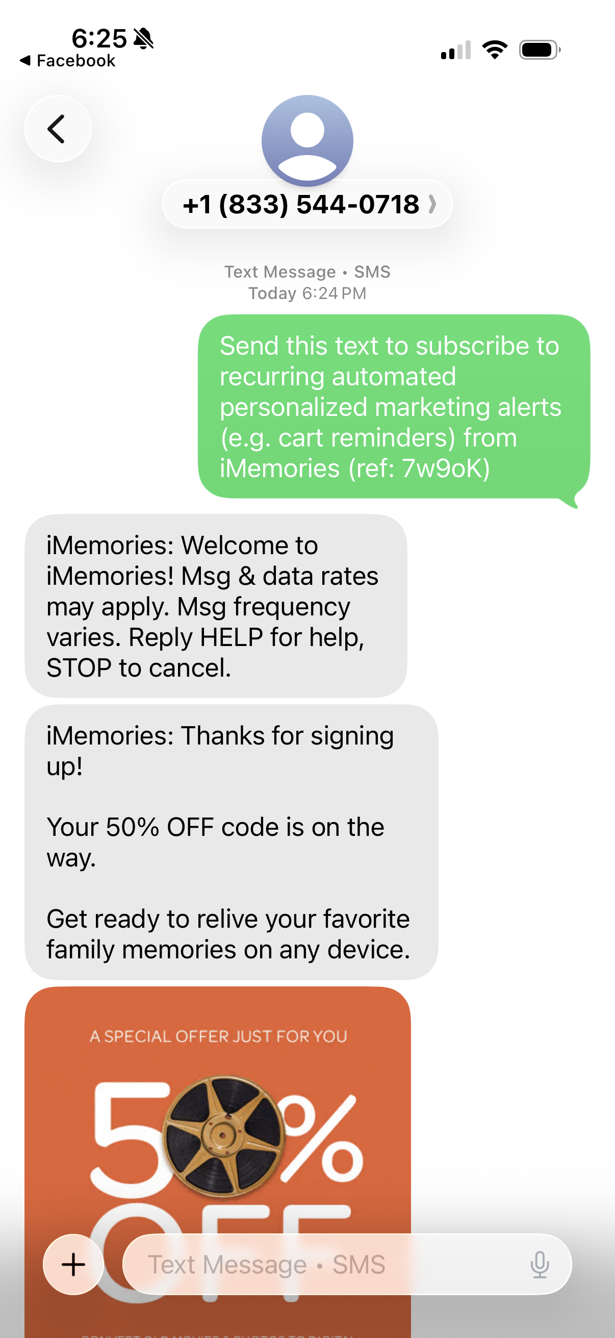
After completing all 5 pop-up screens and replying YES, no discount code arrived. The Klaviyo SMS keyword automation isn't firing. Any user who completed this flow received a broken promise before making their first purchase. iMemories' SMS flow works immediately — welcome text, offer image, and working code delivered in under a minute.
02 — The Website
8 scrolls to reach the strongest proof points. The best content is at the bottom.
The homepage is structured as a brand catalog, not a conversion funnel. The most compelling content — trust credentials, format specificity, differentiators — sits at the bottom, after most visitors have already left.
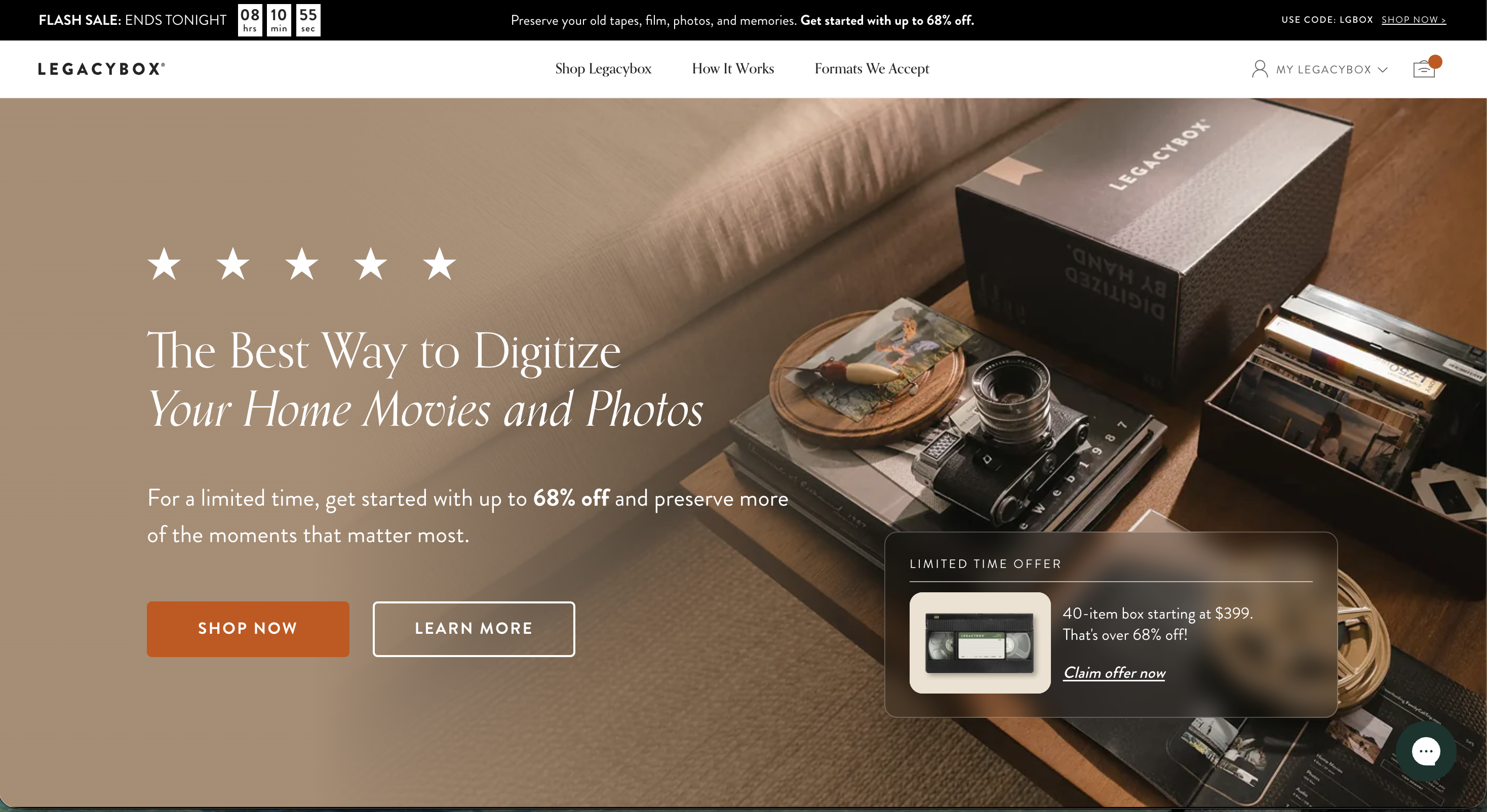
Above the fold: two competing discount signals (a 68%-off banner plus "USE CODE: LGBOX" — which doesn't work at checkout). The hero pop-up defaults to the most expensive SKU with no "most popular" label. The banner text is too small to read on desktop.
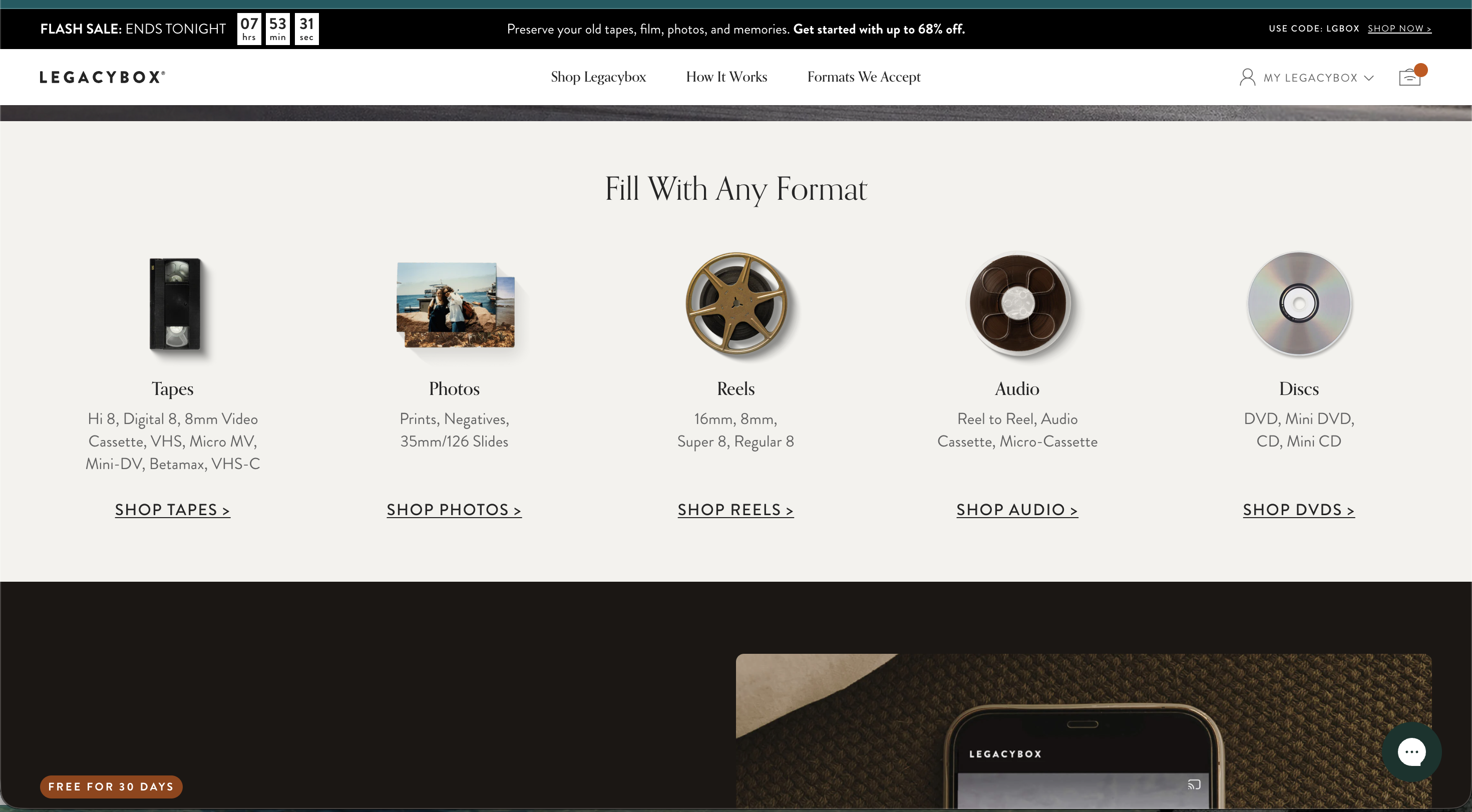
Middle of the page: "Fill With Any Format" — the most practically useful navigation on the site — is buried here, not in the top nav. A user searching "how to digitize 8mm film" has no direct path to this from the homepage.
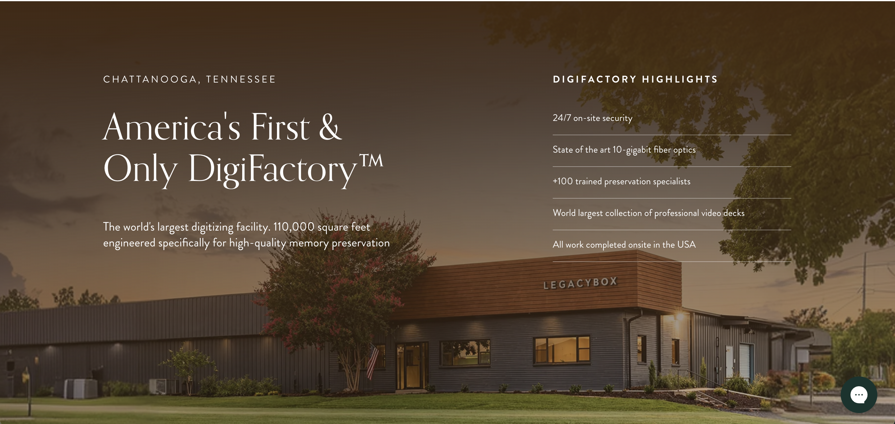
Middle of the page: the DigiFactory — 110,000 sq ft, 100+ specialists, the world's largest collection of video decks — answers the category's core objection (can I trust strangers with my irreplaceable originals?) but appears after multiple scrolls, after most visitors have made a decision either way.
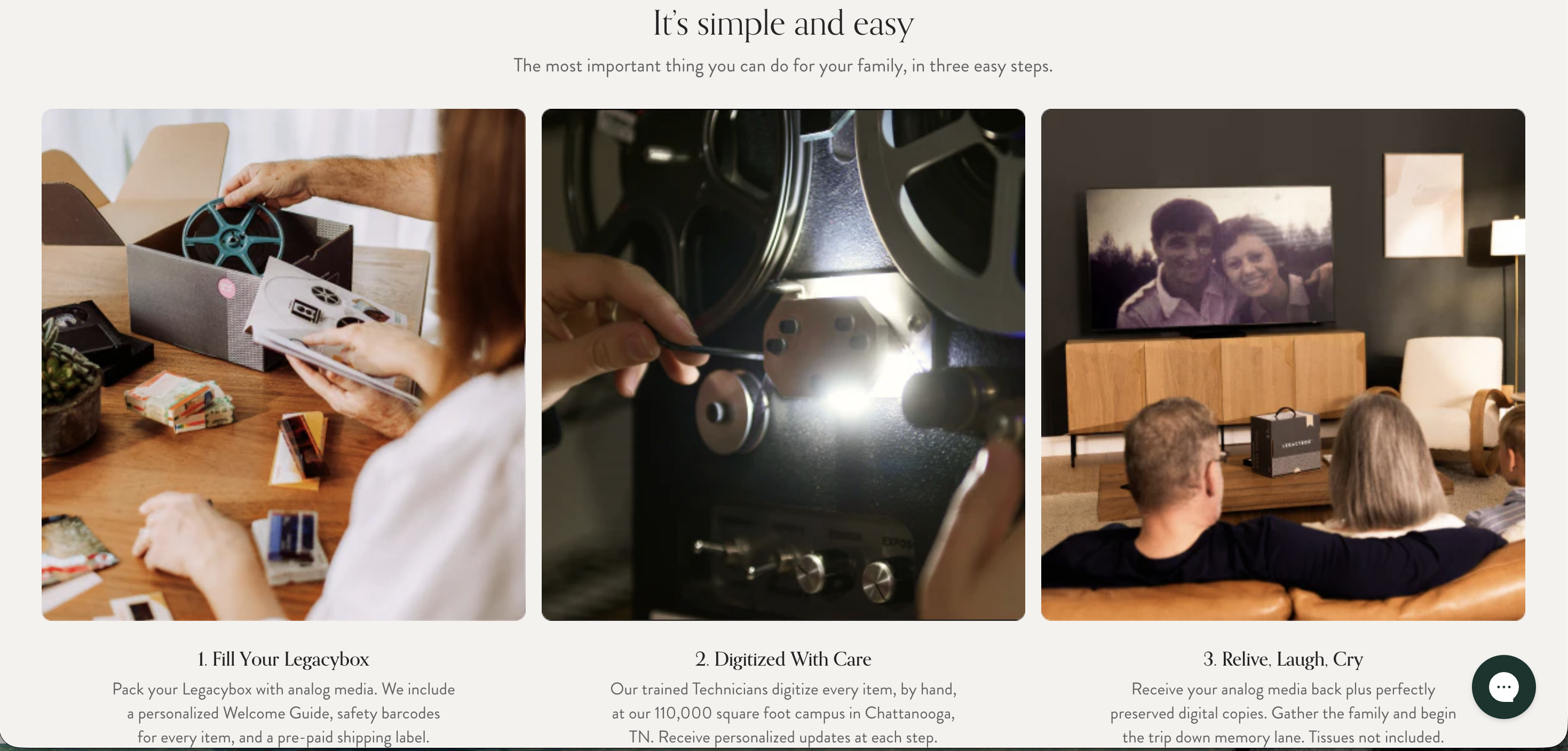
How It Works page: roughly 50% duplicates homepage content. A visitor who clicks "Learn More" needs conviction, not a homepage remix. The page should answer: what happens to my originals in transit? What's the turnaround? What if something is damaged?
Product cards: default to filled box interiors, not empty exterior shots. The interior — tapes, reels, photos packed in — is the image that makes a pricing decision concrete. It's currently hidden behind hover/tap.
DigiFactory: move it before pricing. It answers "can I trust this?" before someone decides whether to buy.
How It Works page: rebuild it as an objection-resolution page — chain of custody, turnaround time, what happens if something is damaged. Not a homepage remix.
03 — The Email Program
9 emails in 5 days across 3 flows running simultaneously.
Three Klaviyo flows hitting the same new user with no suppression logic between them. The best emotional writing is in the cart recovery flow. The brand story email exists — it's just the sixth email of the relationship, not the first.
Fix 1 of 2
Flip the welcome sequence — brand story first, discount second
Welcome Email #2 ("The tape that started it all") is a genuinely good email. Founding story, emotional hook, links to /pages/our-story. It's exactly what the first email should be. Swap the order: open with the story and the reason to care, then follow with the offer as a reason to act now. The abandoned cart copy — "Old tapes and photos aren't just outdated. They're fragile." — belongs in the welcome flow, not buried in cart recovery.
Fix 2 of 2
Suppress new subscribers from flash sale blasts for the first 7 days
A new subscriber in the welcome flow should be experiencing the brand, not simultaneously receiving broadcast blast campaigns. Klaviyo's suppression filters make this straightforward: exclude users who received Welcome #1 in the last 7 days from blast sends. The welcome and abandoned cart flows are already doing the right job. If a sale is active, add it as a top banner within those existing emails — the message reaches the right people without a separate blast competing on the same day. Constantly extending broadcast sales trains new users to discount your brand equity. Instead, use a structured 30-day post-purchase lifecycle window to introduce tiered value bundles and upsells based on the user's box size selection, maintaining margin integrity.
The page speed problem underneath it all
Legacybox's core customer skews older — the demographic with VHS tapes in their attics. That means older devices, variable connections, and less patience for slow loads. The homepage fails Google's mobile PageSpeed test, and every email in the program drives traffic to it.
The pattern across the category
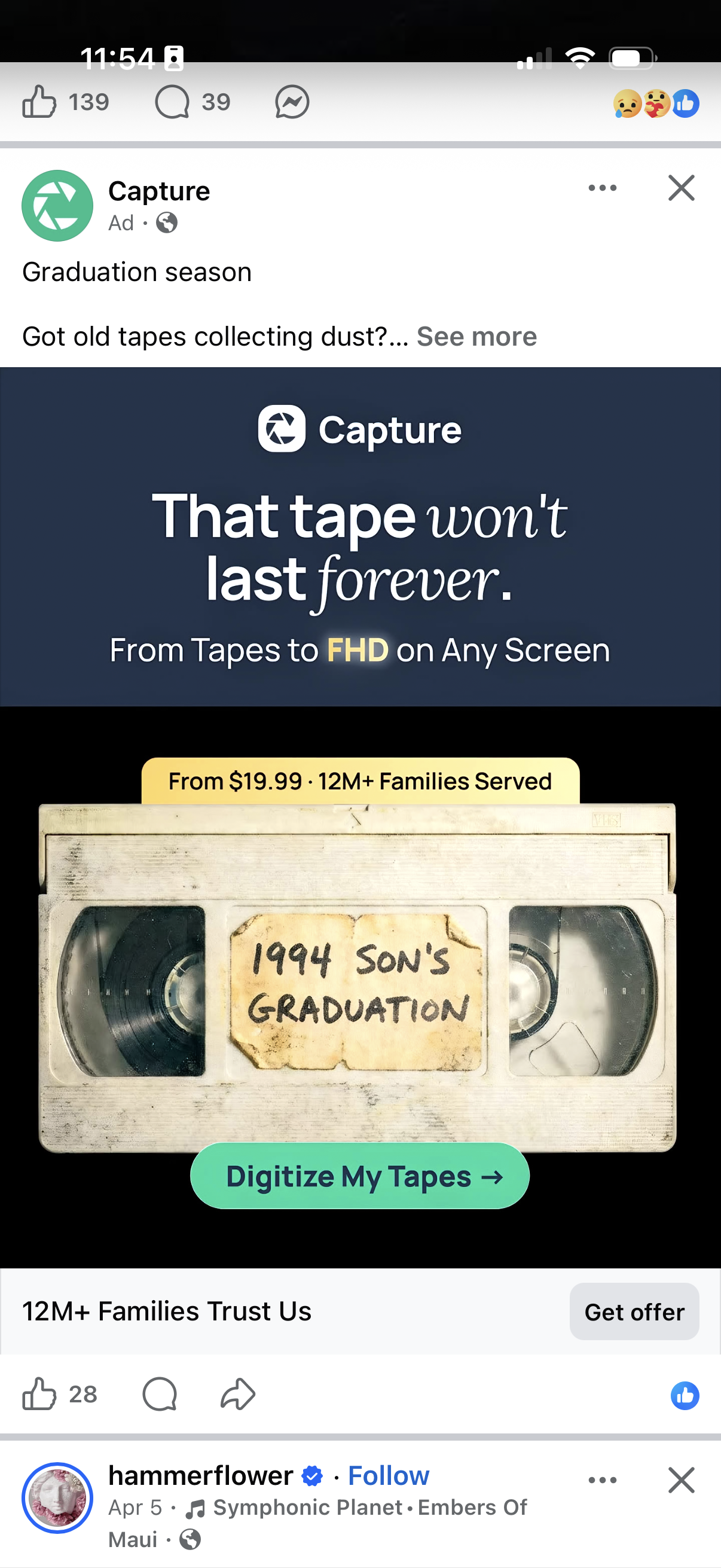
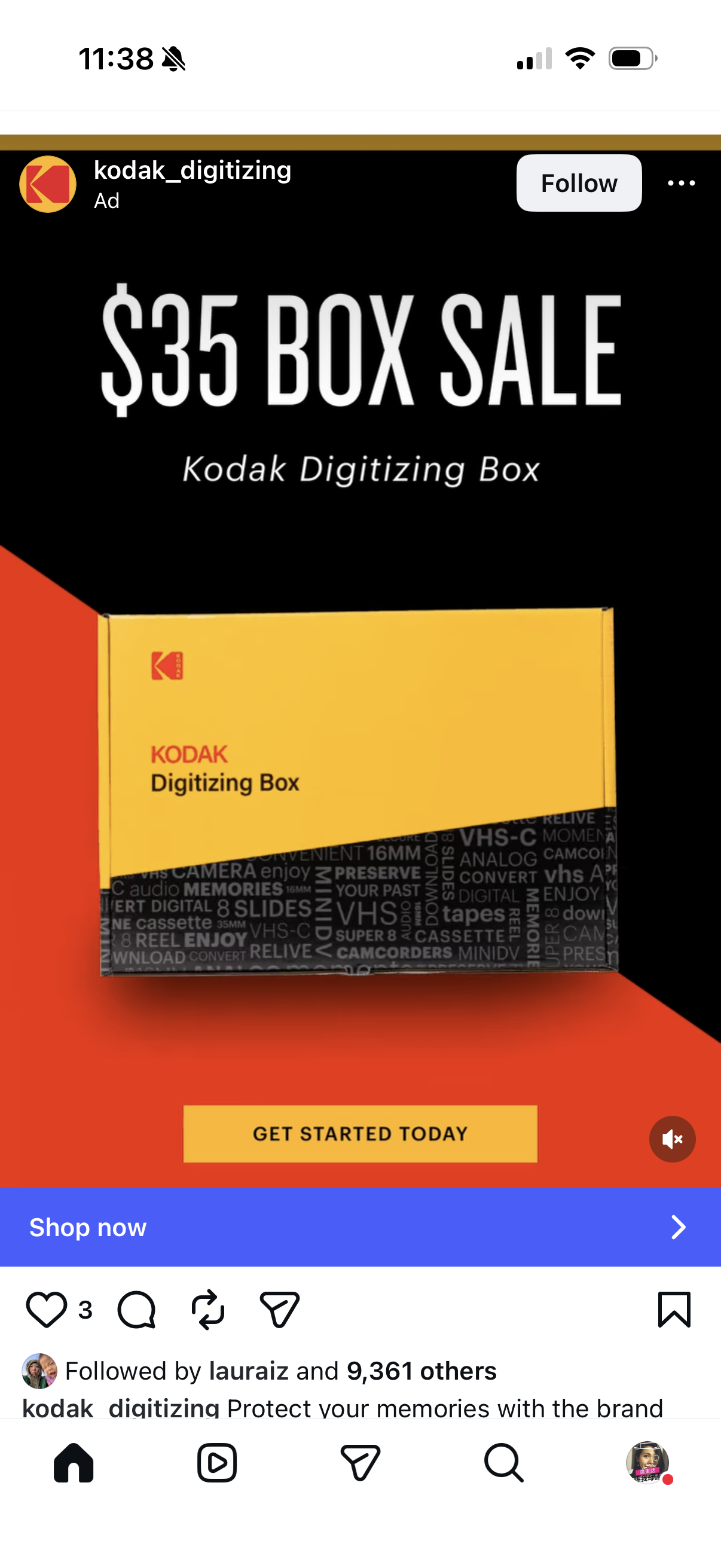
Three competitors, each cleaner than Legacybox in at least one execution fundamental.
04 — What I'd Fix First
Six fixes, in priority order.
Ranked by leverage against effort. The first four are Klaviyo configuration and copy, not engineering — they could ship in the first two weeks.
Legacybox already owns the most moving story in its category. Most of these fixes reorder what exists rather than invent anything — which is exactly the kind of high-leverage, low-lift work I like walking into.